

I marked the paper with green oil pastels to represent the darkest areas of the photo. Then i used a blue oil pastel stick to mark in the areas that are more intermediate tones in the photo. Maybe i should have used cool colours to represent the dark area and neutral temperature colours for the intermediate tones. I already wasn't liking my colour choices or that you could see it was a persons face. So i knew this was a write off. I used a big brush and wetted the paper and then put cellophane wrap over the drawing and lifted off corners of the film one at a time and painted cadmium red water colour on the underside of the film, and then pressed it back down to the paper. This didn't improve my liking of the picture at all. So i used my yellow pallet knife and scraped very hard to move the oil pastel around and mix the blue and green a little. I also used the edge of the knife and made some deep directional grooves. Really this was a complete yucky mess and not at all what i was going for. So i tried again with a 5x7ish sized paper.

I used a big inch sized brush to make some blue marks where the dark areas should be in relation to the photo. I wish i had taken a photo of just the blue strokes. I didn't worry about detail or representation at all. I didn't like the pattern it came out as, so i was already desperate to save it. So i went back to laying the cellophane over the painting and i used a tiny brush and slipped black paint into the edges of the big blue strokes and pressed the film back over that area each time. I continued this and tried to keep the sheet balanced with not one side or top or bottom having more black than the other. It still seemed a little boring, so i added a little bit of red to some blandish spots that were just sort of grey.
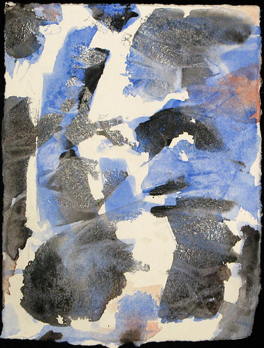
When i removed the cellophane this morning, this is what i had. I'm thinking of adding a bit of yellow in to the white areas so there are not so many sharp edges and add a bit of warmth. I'm also going to go over the blue strokes again to hopefully add some dimension. So this picture is already more cluttered than i was hoping for. Obviously i need to do a pencil sketch of where my big blue strokes should go. Lack of a satisfactory initial drawing seems to be a reoccurring issue in my failures.
Update - December 21/08


Yesterday i added some yellow (as seen on the left photo) then i put another layer of blue over the blue strokes and splattered some red paint to try and add more warmth and perhaps another dimension (as seen on the right photo). I don't know why exactly i splattered the red paint, it was just missing something. It's not a completely awful little painting, but it's not something i'll be showing off to everyone either. I think it was mostly just an exercise in trying to make the best of bad planning or sketches? Obviously need to give it another go.
No comments:
Post a Comment