This isn't too exciting. Just a little experiment to see how the different blues and reds look one wash over another. It also gives me a pretty clear idea which reds and blues are cooler and warmer than others.
Motivation wise, i have a couple things to keep me busy and productive. Recently we learned one of our close friends has breast cancer, so i wanted to do something positive. I talked with my friend Darren Nixon who has a restaurant, Divine and some available wall space, so i talked with him about having a silent auction of my paintings to raise money to fight breast cancer. So i need to keep focused and get productive.
Tuesday, December 30, 2008

Monday, December 22, 2008
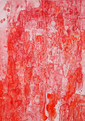
Red Drip
This painting was made in the first half of 2008. It's pretty big, 20x30ish. I'm really happy with the way it turned out. I only spent one evening working on it. I gave it to my brother as a thank you present for being my best man when i got married this summer.
It's watercolour on drawing paper, so it buckled and waved quite a bit as different areas got wet. That created a bit of an issue when i was trying to frame it, which turned out to be more frustrating than painting it.
The painting process began with flicking red paint on the flat paper. My original intention was to make it a Jackson Pollack-ish style drip painting. I haven't developed a great way to do that with a watercolor brush yet so i wasn't getting enough coverage to create much of a painting.
My next step was to make big really wet blotches and then to tilt the paper so the wet spot would run. I did several blotches in all four directions and ended up with a bit of a multi-paned window pattern.
Then i tried to fill in all the white areas but excluding the area immeadiately around my splatter dots. So in effect the dots would have little white halos. I filled some areas with warmer red and some with a cooler red. I added a bit of blue to some wet red areas to create even cooler areas, but they turned out pretty much blue.
I used a tiny brush so it took at least a couple hours to paint this. But that's about it and how it was created.
When i take pictures of these paintings i need to include a grey card so a colour balance can be done. I wish i had documented the process of the painting, but that's the idea for future paintings.
Friday, December 19, 2008
Headshot
I started a new painting last night. I still have a lot of room for improvement documenting my processes. I finished a little 4x6ish study without taking pictures of any intermediary steps. I want this painting to be completely abstract, but i started with a head shot of one of my friends.


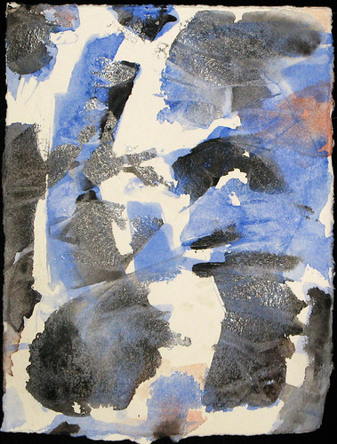


I marked the paper with green oil pastels to represent the darkest areas of the photo. Then i used a blue oil pastel stick to mark in the areas that are more intermediate tones in the photo. Maybe i should have used cool colours to represent the dark area and neutral temperature colours for the intermediate tones. I already wasn't liking my colour choices or that you could see it was a persons face. So i knew this was a write off. I used a big brush and wetted the paper and then put cellophane wrap over the drawing and lifted off corners of the film one at a time and painted cadmium red water colour on the underside of the film, and then pressed it back down to the paper. This didn't improve my liking of the picture at all. So i used my yellow pallet knife and scraped very hard to move the oil pastel around and mix the blue and green a little. I also used the edge of the knife and made some deep directional grooves. Really this was a complete yucky mess and not at all what i was going for. So i tried again with a 5x7ish sized paper.

I used a big inch sized brush to make some blue marks where the dark areas should be in relation to the photo. I wish i had taken a photo of just the blue strokes. I didn't worry about detail or representation at all. I didn't like the pattern it came out as, so i was already desperate to save it. So i went back to laying the cellophane over the painting and i used a tiny brush and slipped black paint into the edges of the big blue strokes and pressed the film back over that area each time. I continued this and tried to keep the sheet balanced with not one side or top or bottom having more black than the other. It still seemed a little boring, so i added a little bit of red to some blandish spots that were just sort of grey.
When i removed the cellophane this morning, this is what i had. I'm thinking of adding a bit of yellow in to the white areas so there are not so many sharp edges and add a bit of warmth. I'm also going to go over the blue strokes again to hopefully add some dimension. So this picture is already more cluttered than i was hoping for. Obviously i need to do a pencil sketch of where my big blue strokes should go. Lack of a satisfactory initial drawing seems to be a reoccurring issue in my failures.
Update - December 21/08


Yesterday i added some yellow (as seen on the left photo) then i put another layer of blue over the blue strokes and splattered some red paint to try and add more warmth and perhaps another dimension (as seen on the right photo). I don't know why exactly i splattered the red paint, it was just missing something. It's not a completely awful little painting, but it's not something i'll be showing off to everyone either. I think it was mostly just an exercise in trying to make the best of bad planning or sketches? Obviously need to give it another go.
Thursday, December 18, 2008
Gift
My plan is to blog all the stages of a painting. But this latest painting was pretty much done before i started the blog. I didn't document the beginning stages. This photo was the almost complete version.

The painting is a Christmas gift for my sister-in-law. I'm not entirely pleased with how it turned out. I'd have liked to make the top part of the tongue rounder than flat, and have the right ear higher on the head, and probably make the shape of the head a little rounder than oval. But it's supposed to be somewhat abstract and not necessarily immediately recognizable, so it will do as is. Next time i'll have to be sure i'm happy with the drawing before getting on with the painting.
In this painting i experimented with a couple ways of adding texture. In the tongue, i put down some pinks and blacks in wet paint, and then lay cellophane that was kind of wrinkly in the wet paint. I pulled the cellophane off when the paint was dry. I wish i hadn't put so much black in the mix and only used pink and white for the tongue.
To make the trees in the background, i lay the cellophane down and scooted several colours under it and then waited for the paint to dry before lifting off the wrap.
For the hair on the cheeks and the grass, i made some hard scratches on the paper with a pallet knife to represent individual hairs and blades of grass. I'm not entirely pleased with that either. Maybe i should try making lighter scratches and doing several layers of scratches and paint and let it dry between each application?

The final version differs from the earlier photo because i painted over the white fence with green grass paint and blended the trees with wet green paint as well. I didn't want the white fence to pop so much. I also added a layer of reddish paint to the body to match the colour of the head better.
Dianne marvelled at how much better it looks framed. I agree. Framing anything seems to make a huge improvement.
Table Tree Sculpture
Okay, i realize this is supposed to be a painting blog, but i thought of this great idea for a table walking to work today and i'd better write it down before i forget about it.
Make a table from a pegboard with holes. Put fibre optic cables down each hole, and bundle the cables at the bottom to form three or four tree trunks. Wrap each cable from top to branch to trunk with a putty or clay. Cut off the excess cable on the top side of the pegboard. Remove the pegboard and the legs of the pegboard table. Put a light source on the bottom of the fibre optic tree trunk. Put a glass table top on the top.
Another variation might be to put coloured glass cups on the top side of each cable strand to form little flowers at the top of the tree.
Wednesday, December 17, 2008
Family Canoe
This painting is one of the first attempts at a painting I made for my sister and her family. I'll ask my sister to take a snap of the painting i eventually gave them so you can compare this one and the final version.

This one has a higher viewpoint of the family in the canoe than i cared for. The lower viewpoint in the final version looked more like the perspective of the rear paddler in the canoe. I'm not completely satisfied with the cropping in the final version. But i was under a deadline, so i ran with it
The purpose of the painting was to create a family vision for my sister and her family. Bonnie and Troy adopted two little girls from Ghana. But the Canadian government was dragging their heels granting the girls visas. So the little girls and thus at least one of the adopting parents also had to wait in Africa for the visas to be granted. This painting was meant to be a reinforcing vision of the whole family together in Canada, in a canoe.
Update - Dec 19/08

Here is the version of the painting that i gave to the family. As you can see, it's certainly less abstract and the perspective is a little lower and the girls seem closer. Probably more like you'd see if you were actually in the canoe. It's funny the people look transparent and the water looks more opaque. It should probably be the other way around, seeing how water is usually pretty see through. I wish there was some slight difference between the inside sides of the canoe and the bottom of it. I wouldn't have cropped it so tightly if i could change that too. Oh well, live and learn.
Tuesday, December 16, 2008
Dawson City Meeting
This painting was meant to be a wedding gift for our friends Davy and Zoe. It didn't turn out to my liking, so they've never seen it. I believe it was the summer of 2007 that they got married and the painting was started. This photo of the painting has better colour saturation and pop than the actual painting, so i quite like the photo of the painting.
It's my understanding that Davy and Zoe met in Dawson City at an annual music festival that is held there. Initially i wanted to incorporate an elephant to represent Davy, who is Indian, and a moose to represent Zoe, who is from New Brunswick, the big red and white tent that is set up at the music festival, and this red hotel from a picture i found of main street Dawson City. I think they met in a bar, but i don't know if it was this hotel's bar or not? Odds are not. Dianne didn't like the idea of the animals representing people, and was worried Zoe wouldn't find being portrayed as a moose amusing. So i settled for this design with the hotel and the big tent.
I quite like this photo of the painting, so i may go back and try the painting again but make sure it's just as saturated as this photo. I'm also going to work on the original concept of incorporating the moose, maybe doing a yoga pose and with a binder dot, and with an elephant too. I quite like the idea of putting two animals together that definitely don't have the same geography to represent two people in harmony with different backgrounds.
I'll make some sketches and blog my progress.
Inspiration
I've been inspired to start this blog after viewing a video posted by Chase Jarvis, http://www.viddler.com/explore/chasejarvis/videos/27/
In this video the speakers talk about how you can get so much site traffic by giving people something of value for free, and what comes around goes around. Blogging helps people find you, know who you are, and explain what you're doing. When Google ranks you, what you're doing is mentioned over and over, so you'll get ranked higher than a static site.
I've watched this video about 4 times now and the nuggets I've taken from it include; providing value to a community with a common interest, turn myself inside out, be honest and share the frustration as well as the victories. It's about the human experience. Self promotion will fail.
This blog will document my painting. Hopefully I'll get in my 10,000 hours and become somewhat proficient at it over time. Here I'll share my trials and progress, and share techniques and inspirations with others interested in painting.
Subscribe to:
Posts (Atom)