Monday, January 19, 2009
Silent Auction
I talked with my buddy Darren down at Divine in Okotoks again about when i could put my paintings up for a silent auction to raise money for breast cancer. He said i could have some hallway space, but a whole restaurant show would have to be a year or so away. Some other artists are queued up. That might work out best because we could have just a few pieces up at a time for auction, and when a month is over put some other works up in their place. Most of the artists' work stays up for 6 months, and i don't think that would be an appropriate duration for a silent auction. It would be nice to have the whole place, but given my limited number of works maybe this is the best way to go until i have lots of stuff ready to fill the restaurant.
Friday, January 9, 2009
Warm Window
For this painting i'm starting with a photograph. I'm not too sure if the photographer needs credit or if i need permission? I usually use my own pics as inspiration. But i doubt i need to so that's what i'll assume.
I modified the photo in photoshop by using the "cutout" button, which reduced the photo to four colours without any blending. Kind of a paint-by-numbers look.
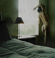
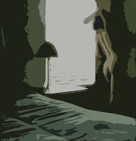
But i want to use an art deco kind of colour palette, so i found a nice art deco poster, and sampled some colours from it and filled in my modified photo with these colours. I'm not completely confident this palette suits the subject matter, but it's pretty abstract and the subject might be lost to most people. So i'll give it a whirl.


The plan is to do a line drawing on my sheet of paper and fill in the shapes with colour and not blend but keep a crisp line between shapes. I'll try as best i can, being red/green colour blind, to match the colours in my modified photo by applying multiple layers of each colour. That is, i won't blend the paints on my palette, but try to achieve the proper tints by layering washes on top of one another.
Update: January 15/09
Update: January 15/09


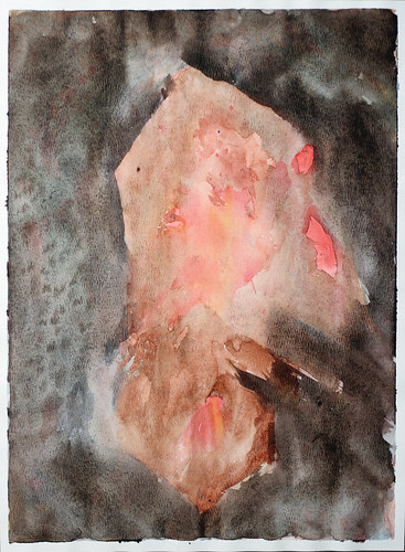
I worried about doing the sketch. The proportions of the altered photograph are different than my paper size. The photo is more squarish than rectangular. It didn't turn out to be an issue though. I put the window lines at roughly 1/3 and 2/3 of the sheet and again about 1/3 up from the bottom and then took a stab at fitting everything from the photo roughly onto the sheet. I struggled a little bit trying to get the woman's bottom just right and finally resorted to drawing a grid on that part of the photo and another on that section of the paper to get her shape just like in the photo.
I tried to pick a red colour based on the warmth/coolness and realized several layers of washes would have to be applied to get the proper tone. The rest of the colours were also picked using this criteria.
I tried to pick a red colour based on the warmth/coolness and realized several layers of washes would have to be applied to get the proper tone. The rest of the colours were also picked using this criteria.


Obviously the dark background in the photo was more purplish than the blue that was going on in the painting, so after the blue wash dried, i put a red wash over it. This purple looked too red when dry, so i again put another layer of blue. This same process was used to try and achieve the tint of the blackish area at the bottom of the painting so it matched the altered photo. Many layers of washes of varying tints were applied.
At one point i decided a blue wash was necessary over the blue and red areas so i painted over both sections at the same time. I don't like the way that idea worked because some of the dried blue and red was lifted with the new wet wash and mixed with the neighbouring colours. So unless that effect is desired, i'd paint over each colour individually. I finally put black wash over much of the darker areas but i applied it over each color one at a time so the red wasn't transferred into the purple or visa verso.
At one point i decided a blue wash was necessary over the blue and red areas so i painted over both sections at the same time. I don't like the way that idea worked because some of the dried blue and red was lifted with the new wet wash and mixed with the neighbouring colours. So unless that effect is desired, i'd paint over each colour individually. I finally put black wash over much of the darker areas but i applied it over each color one at a time so the red wasn't transferred into the purple or visa verso.


I'm pretty happy with the result. It's looking a bit too paint-by-numberish for my taste, but i like that similar tones and tints were achieved as the altered photo. It might look really smart with a silver metallic frame. I'll try to pick one up from Ikea soon.
When i wasn't working on this or waiting for a layer of wash to dry, i was setting the piece upside down on the easel because i wasn't sure if Di realized the subject was a derrière, and she isn't usually too fond of any nudity or even painting girls with clothes on. So i was hoping this was too abstract for her to decipher. I was almost done though when she made some comment on the colour of the woman, so it turns out she knew what it was after all. She likes it too. Go figure. Women are complicated.
When i wasn't working on this or waiting for a layer of wash to dry, i was setting the piece upside down on the easel because i wasn't sure if Di realized the subject was a derrière, and she isn't usually too fond of any nudity or even painting girls with clothes on. So i was hoping this was too abstract for her to decipher. I was almost done though when she made some comment on the colour of the woman, so it turns out she knew what it was after all. She likes it too. Go figure. Women are complicated.

Wednesday, January 7, 2009
Amanda
I quite like the way this one turned out. I've had a funny array of comments on facebook regarding it.
To create this one, i started with a photograph of my friend Amanda and manipulated it in photoshop. I used the "cutout" button with 4 levels and it looked pretty abstract; just like a bunch of shapes. I printed that and referred to it generally as i painted these shapes.
I may have given this one away. If not, i think i will use it in my silent auction at Divine in Okotoks to raise money to fight breast cancer.
Tuesday, January 6, 2009
Silent Auction
My esposa was urging me to tell our friend about my plan to have a silent auction to raise money for breast cancer. We were all watching the hockey game lastnight and it did not seem like the appropriate time. I don't want to be painted with any saintly light, when especially i'm so far from accomplishing my goal. On the other hand, it might be nice for our friend to know we all want to do what we can to support her and ensure a win. It might also be nice to take her to Divine in Okotoks and surprise her with what i'm doing. I don't know when or if i should tell.
Our friend saw the surgeon yesterday but i didn't converse with her about it as much as the esposa did. Apparently she's considering a double mastectomy even though one breast is clear and has an independent likelihood of developing cancer from the other one. This consideration is probably a reflection of how stressful and how out she wants this thing. Indeed she and her partner said their lives seemed to be flashing before their eyes, referring to so many decisions they were facing.
I wish hours of hard labour was all it took beat this thing. Then i have no question we'd win. At any rate i'm sure everyone will do what they can. I've decided to set aside non-negotiable hours to devote to painting.
Monday, January 5, 2009
Headshot
I'm making another attempt at my headshot abstract painting. This time a number of little study paintings were done until a reasonably pleasing design was achieved. The two primary colours were picked utilizing the blue and yellow mixing study (see the previous post). I liked the way Prussian blue and Cad yellow combined. I wanted one of the colours to be warm and the other cooler to get a yin yang thing going on. But i also wanted the blues and greens to be a little bit representative of the subject's eye colour. I'm not sure if either of these objectives were met, but i'll save judgement until the end.


I've been having a hard time making any progress on this project in the last few days. Perhaps it's a function of the holidays or maybe non-negotiable time will have to be scheduled specifically for painting. I want to get a portfolio together for the restaurant auction asap.


Update: January 7, 2009


Yellow strokes were added over the first wash of blue strokes. Then i decided the big opening in the centre needed some horizontal action. I still don't disagree with that, however as soon as i put the horizontal blue strokes in the centre of the painting i was kicking myself. I should have been more careful and put some compositional thought into it. After that dried, i added some yellow underneath the horizontal blue to try and move the centre of that mess downward, unsuccessfully.


I added another blue layer vertically to try and fill in that centre hole and repeat the vertical curvy line left of centre. But the horizontal line still stuck out like a sore thumb.


I filled in some of the white negative space with a very diffuse yellow wash to try and take the bright edge off. Then i wanted to add some black to the most predominate gestures to fill in the darker side of a full tonal range, to have a complete tonal range in each gesture. Then I decided to move the whole key of the painting to dark and blue.


I washed off paint along the sides of the gestures trying again to add tonal depth to the gestures.


I'm pretty happy with it now, however i think it needs something in top right to balance the painting, and i'm going to try and wash off more of that horizontal stroke in the centre.
Update: January 8, 2009
Those few horizontal brushstrokes in the middle are causing the most trouble in this painting. I re-wetted the paper and tried moving the paint around to "erase" them. I then had to reinforce the vertical lines that were over the horizontal ones. That wasn't as successful as i hoped. Then i took a plastic eraser to the offensive parts and again had to re-apply paint to the vertical strokes. I think the horizontal part isn't sticking out as much as a couple days ago. After applying so much dark tones on the vertical marks over the horizontal line, i think the whole thing is now looking tonally flat. I also made a dark horizontal line in the top right corner to add a little more balance.


I splatted some Prussian blue on the light area at the top, and quite liked that. I then splatted water on the middle and lower third hoping to get more interesting texture to compensate for the whole thing still looking flat. But that didn't do much. So i went back to the old crutch and applied yellowish wash onto the entire surface of a big piece of cellophane film and lay that on top of the entire painting. I let that dry before removing it. It's done.


I asked Di if she liked it, and she said "no". I chuckled inside. This girl is brutally honest; to a fault sometimes. I guess it's not really a fault, just brutal. And given a choice I'd rather hear the truth than have a friend awkwardly lie. I think the photo of the painting looks better and is more vibrant than the actual painting. Maybe i should spray glossy fixer on it? I don't like the painting either, so Di and i are in agreement. I'll keep it, but hopefully i'll come up with some better stuff for the auction.

Friday, January 2, 2009
Blue and Yellow
Here is another study of different yellows and blues mixing together. I suppose this kind of experiment should be done over and over because it might make a difference what colour is on top, the paper, or the dilution of the washes.

Subscribe to:
Posts (Atom)