Saturday, December 5, 2009

Jong Ro Homage


I really admire the paintings of Jong Ro. I suppose the fact that i like her paintings is enough in itself, but i'm also wanting to learn a lot more about abstract painting. I wonder if there is a theory backgrounder that can be found on the subject, so that i might appreciate abstract much more?

Jong Ro painting.

Monday, November 23, 2009

Pool Shark Attack continued

I've had enough of this painting. I really don't think i can fix it up so i'll love it. Maybe if i took a fine brush and detailed the hands and face? But that's not going to happen. The law of diminishing returns rules.

another iteration


yet another iteration


finished

Friday, November 20, 2009

Yacht


I quite like this one. Even though the entire time i was looking at it as a horizontal. In fact i'd had enough of it and thought of it as a failure. But i thought i'd take a picture of it and upload it to istockphoto anyway in case someone wanted to use it for grunge texture, or something like that. But when veiwing it vertical like this, i really like it.

I planned on painting shapes, like i did for the bodhi tree, but in this case i'd paint repetitive triangles, thinking of sails. It really wasn't abstract enough in the beginning so i kept adding and subtracting layers many times and made some scratches and texture lines with a watercolor pencils until finally i was just through with it. It wasn't going where i'd hoped it would.

Looking at it vertical is a really happy accident.

Thursday, November 19, 2009

Pool Shark Attack

For this painting i referred to a photo i took last year. In the photo you can obviously tell Danielle is on the pool table at my office, but it's not so obvious in this painting. I suppose that gives it a bit more mystery.


I don't think it's quite done. I will probably define the hands a little more and put a little more shading, particularly on the right of the face and body to give more roundishness and less flat looking. I also think the background needs some more reddishness near her arm and head; to give it a more bloody look. And the dress needs a strap on the left shoulder.

It took quite a few layers, as you can see in this video to decide the colouring and whether it would be more of a middle value or a very dark key.


The time lapse video was captured at 1 frame per second and the playback is at 15 frames per second. The actual painting time is around an hour and a half.

Friday, November 13, 2009

istockphoto

Uploading photos of my paintings to istockphoto.com may turn out to be a better idea than i expected. I only have a couple in istock's Vetta collection, but they're earning a nice little income.

I've probably earned more from them on istock than if i'd sold the originals. Especially the little 5x7 inch painting. That wouldn't have earned >$50 by selling the original. And i haven't incurred any shipping charge.

By taking photos of a painting's progress, i can also avoid the issue of ruining a painting by continually trying to improve it. Jackie always says, "leave it alone!" But i'm not completely satisfied, and it turns out worse than it was. By capturing it along the way, some pre-finished version might be quite sellable on istockphoto.

I suppose people are buying from istock so they can print and hang for their interior design.

Thursday, November 12, 2009

Torso


I painted this from a photo i liked. But first I manipulated the photo in photoshop until it was quite abstract. Then i painted from the manipulated photo.

Because i used a long sheet of paper, i think the proportions are a little too elongated. I might squish the height of a photo of my painting if i upload it to istockphoto. Or maybe not?

Wednesday, November 11, 2009

Bodhi Tree continued


I've added some more squares, trying to fill out the tree's foliage a bit more. Trying to keep a careful eye on balance. It's at the point where it won't give up the stains via my wet lifting technique. So not much can be removed, only added. I think it's pretty much finished. Unless i walk by it and see a gaping hole out the corner of my eye.

I like the painting. Don't "love" it. Perhaps i'll like it more when it's framed with a white matte?

Tuesday, November 10, 2009

Bodhi Tree continued


Lastnight I worked on the same sheet of paper that seemed ruined on Sunday. I tried to add colour blocks to represent the big areas of leaves on a tree. I wetted the paper and lifted the old paint and painted in the new yellow or blue. I thought this piece was beyond repair, but now i'm quite liking it again.

I think there is too much negative space around the tree in the sky area, but i plan to crop over that area with the matte from the frame i have in mind.

I'm not sure if it's done now? I think i'll have to walk by it and glimpse it, or put it upside down to see if it seems balanced.

The actual painting doesn't have as much pop or saturation as this photo. But it may look better in the photo and i'm going to upload it to istockphoto, so i didn't dial down the colour saturation to make a truer representation of the painting.

Friday, November 6, 2009

Bodhi Tree

I've been asked by Joanie to make a painting. Cool!

Unfortunately i've been having a hard time getting something to be happy about. I initially wanted to do something drippy and fill in all the negative white space thereafter. This is crazy intensive for a big piece. But i spent some time trying it. When i got to the sky space around the tree, i really liked the little dots created from lifting the wet paint with a dry brush. The sky was a similar look as another painting Joanie liked.
So i thought i'd try to extend this wet and lifting technique into the dripped tree area. Perhaps i did it too much? But it wasn't turning out. Unfortunately painting doesn't have an undo button, so i just had to keep going forward. I even got a pallet knife involved with some scraping.
I think this piece of paper is beyond ever reaching a satisfactory state and i'll have to start with a blank sheet again.

Wednesday, July 22, 2009

Good, Bad, and Ugly

I haven't been painting recently and thusly not posting here. That's the bad.

The good news is Travel Alberta emailed me asking if they can use some of my flickr pictures in their online magazine City Spice. They're going to compensate me with MEC gift certificates. Sweet!

The ugly is my plan to try out the recently discovered time lapse photo feature on Jackie's camera and record a painting session. The lawn needs mowing firstly so hopefully i can get to painting thereafter tonight.

Tuesday, July 14, 2009

Malaise

The previous post was a speech i gave at Toastmasters. When i did a rehearsal for Jackie, she didn't like it because she says my time management skills suck. It's more like, sometimes i don't feel like doin' stuff. The Toastmasters club seemed to like the speech though.

I think the really true thing from that speech is that you're not going to be world class at something unless you do it full time. Laziness and what i called "lifestyle" eat up too much of the rest of the day.

The art auction is over. The unsold pieces just have to picked up along with the cabbage and write a cheque to the Alberta Cancer Foundation. So i haven't been as inspired to paint.

Sometimes i wonder if i procrastinate doin' stuff because i don't have much to do? That does sound crazy. I wonder if dr. Phil knows what that's about?

Maybe laziness is a function of nutrition? Yesterday i only had a couple packets of instant oatmeal. That probably reduces the old metabolism to that of a hibernating bear.

Maybe i need to set up a reward for achieving some targets? That does sound childish. I'll run it by Jackie Chan and see what she thinks. Better pick up a basket of apples on the way home tonight too.

Thursday, June 11, 2009

Paradigm Shift Required

In Malcolm Gladwell's new book "Outliers" he examines the difference between talented piano players and merely competent students. The explanation is extraordinary players are not in fact "gifted" but have practiced much more. He asserts, 10,000 hours of polishing is required to shine in your chosen field. He gives several more examples of people who've spent 10k honing their skills. You can probably think of some as well, like Tiger Woods, Wayne Gretzky, Paul McCartney....

10,000 hours is Wow!!! That's 3 hours a day, 7 days a week, for 10 years!

My question is, does a balanced lifestyle including, career, exercise, walking the dogs, charity, gardening, friends, family, and most importantly spending time with my wife, mean i can never be more than a jack of all trades concerning my passions of real estate investing, photography, and painting?

If the hours in the day that remain after the balanced lifestyle is my spare time, are there 9 hours a day to devote to 3 hobbies? Maybe if i don't sleep.

If i want to keep all three hobbies, I'm going to have to compromise on the hours in the day devoted to each field. This is the frustrating conclusion. It's frustrating because i know i'd be much better at any of the three things if i wasn't spending time on the other two.

Lately i've been spending more time painting. The reason is to replace works that are selling in the silent auction to raise money for the Alberta Cancer Foundation. Since i've been painting more, it's obvious my skill is improving. I'm over the moon that my painting is better. It's tremendously rewarding, and yet the exciting part is i haven't even made a dent in 10,000 hours of painting. I can't imagine what my artwork will look like in 10 years.

But of course, because i've been painting more, i've been shooting less. That means my photography portfolio isn't growing, and that income stream isn't growing. Income aside, as a photographer, i'm also stagnating. New lighting techniques, compositions, equipment and special effects aren't being mastered. A growing, yet neglected list of people who want to be shot is frustrating.

What If i spent more time looking for great real estate deals? What would that mean? Probably i'd find more sweetheart deals. Looking for and analyzing deals is something i really enjoy, and besides the fun aspect, there are pretty big kickbacks that are hard to ignore.

One creative option, might be to focus exclusively on buying real estate and retire early, and thereafter shoot and paint to my hearts content. If gardening and watching hockey are sacrificed now, the timeline to retire could be even shorter. If i stopped wasting time walking to work and stayed awake longer drinking espresso coffee every night, who knows how short i could make that timeline to retire and start painting? On the other hand, maybe after 10 years of no gardening, no hockey, no walking and staying up late drinking espresso, i won't feel like painting. Maybe i'll just feel like sleeping?

Currently i'm prioritizing the balanced life, and all three pastimes. It may be impossible to achieve 10,000 hours in 10 years for any hobby by keeping all three, but hopefully i can find happiness long before shining in my field. Perhaps all i really need, instead of an extra 6 hours in the day, is a paradigm shift. To focus attention on the joy i've found in the first few hundred hours investing, shooting and painting, and not how very far i am from being 10 years older.

Monday, June 8, 2009

Carabao

I feel like i had a pretty productive weekend, painting-wise. The weather was crap, so it's an easy decision to stay indoors. And we didn't have any pressing business to take care of, so painting was at the top of the agenda.

I'm feeling more and more confident with my ability to control the paint and my results. I used to be under the impression that if something initially didn't look just right, it was a lost cause and overworking the paper and paint made just an ugly mess. Now i'm realizing how malleable the medium really is. I think making the concertive effort to paint is paying dividends.

Malcolm Gladwell asserts in his new book "Outliers" that mastery of a skill takes about 10,000 hours. He used an example of young piano players and differentiating between the ones who appeared to be truly gifted and those that were merely proficient. People assumed that a few players had a gift or genetic advantage over the proficient piano players, but further investigation reveals the "gifted" players had practiced much more than the others, at least 10,000 hours says Gladwell.

Jackie Chan asked me why i'd been making so many little paintings lately. I wanted some little ones in case people were starting their search at etsy.com with lower prices, and if i had offerings at those prices, it would at least get them into my shop and some exposure to the bigger higher priced paintings. The big painting alone in the shop wasn't getting any viewings. I also wanted to use the smaller ones to practice and quickly experiment with less paper expense.

Sunday i decided to make a big one because making larger paintings is quite different than how quickly little ones are done and i should also practice making the big ones.

I started by taping a 20 x 24 sheet of 140 lb Strathmore paper to my clip board. I used the brown gummed tape rather than the green painters tape because i tried to stretch the little sheets last week and they still buckled and waved when wet and later dried buckled when i used the green painters tape to stretch the paper. The little sheets were of only 90 lb paper stock so being lighter weight might have also limited the ability to resist waving. This big painting on 140 lb Stratmore paper didn't wave, so i'll have to try the brown gummed tape on the lighter paper to see if it's the paper or the tape that matters.
I made a rough sketch referring to a photo i took at the beginning of March of a carabao in the Philippines. I dived right in painting all the negative areas with black paint. My new confidence that i could re-shape it later no matter if i started with the light areas or the darks took the painting quickly to the tone i wanted it to be.

When i got to this point it was starting to become clear that i'd never be satisfied with a photo realistic "Robert Bateman" kinda painting, and that spending the hours necessary to paint each and every plant leaf wasn't how i wanted to paint either.

I used the cellophane film AGAIN, yes. But this time i think it was really appropriate because lying the film in the wet paint and then shaping the wrinkles to curve the way i want really resulted in a natural plant like impression.

It looks pretty much done to me, although i might thin the girl's snout and perhaps make the foreground rise again on the right? And sign it.

Monday, May 25, 2009

Yellow & Blue


I'm pretty happy with this painting. It's a 15x19 inch watercolor on 140 lb Strathmore cold pressed paper. It's mostly a happy accident because the process was not exactly as planned.

The paint mixing chart from the January 2nd blog entry was used as a reference to pick Cotman's lemon yellow and intense blue. I used a dab of Cotman's cobalt blue here and there as well for variety. I'm very satisfied with the color of the painting so having the yellow and blue mixing chart was very useful. I should keep making these kind of charts for other combinations that may be used down the road.

My intention was to put down a big yellow area and then cover part of that area with wet blue and then lift vertical lines of that blue with a dry brush. The paint wasn't lifting very well. Maybe because the 140 lb Strathmore cold pressed paper has more texture and tooth than the smooth 5x7 inch sketch pad paper where i've tried with better success the lifting technique? More water was applied to try and unlock the stain in vertical lines, but this merely softened the line between where paint was and where it wasn't supposed to be. I wanted a more distinct border. So the whole painting was looking quite "soft" and i was disappointed. Then the "old crutch" cellophane wrap was laid on top of the wet mixture and wrinkles were purposefully made vertical. When that was dry, the painting was complete as it is now.

There was a bit of buckling in the paper and the paint pooled at the bottom of these waves. The wrap didn't touch the whole length of the paper because of the buckling. So if i try this one again, i'll make sure to stretch the paper using meat cutting tape to avoid the buckling. I may also try it again using hot pressed or smooth paper to see if the wet paint lifts more readily with a dry brush.

Friday, May 8, 2009

Old Style

I've been working on this pretty big painting for the last week. I've let it dry completely between layers of paint. Probably should have done many studies to figure out the colours before going ahead using a big sheet of 20 x 24 inch paper. Have been trying to adjust colours as it goes.

Part of what's bugging me is that i'm not sure how abstract it is. Of course i know what it is and the repetitive shapes should be matching if it was realistic. Maybe it wouldn't matter so much if it was a much looser style.

Even though i'm not exactly happy with it yet, i'm pleased i've been able to control the paint much more than i could even just a short while ago. I feel my technique is much stronger and less reliant on happy accidents.
Taking pictures and looking at it here has also given me a new prospective and a few of the problems with this painting are much clearer. I'm still optimistic going forward.

Tuesday, April 21, 2009

Rothko Homage

I was watching mtv's cribs on the weekend and Tricia Helfer's home was featured. She breezed by a fantastic painting referring to it as her Rothko. After a little bit of internet research, i have a brand new addition to my list of fave artists.

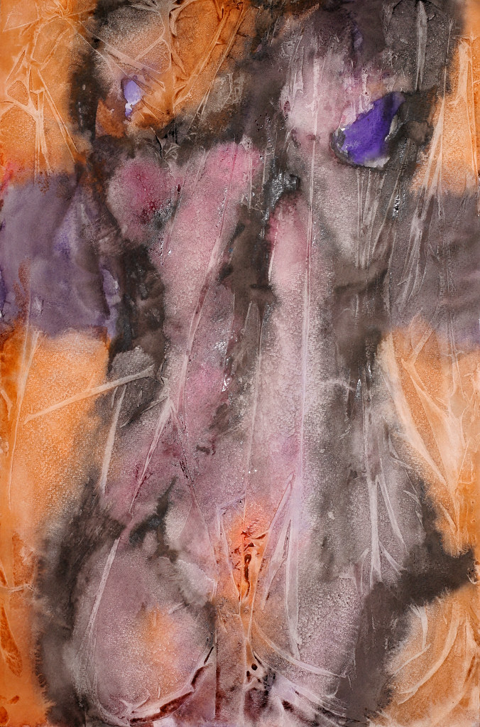
I love the way i react to Rothko's colours and their layers emotionally even though they don't necessarily evoke memories, deep thoughts or anything in particular. The don't require interpretation, they just evoke emotion.

I wouldn't consider my attempt entirely successful. Partly because of suspect technique and also because of my struggles with colours. How is it possible to be affected by colours but unable recreate them? I suspect i need to be patient and apply many layers. And also try to avoid muddling them somewhere along the way.

I started my painting on a sheet of Strathmore cold pressed 140 lb paper, running a Chinese mop brush all around the outside border wetting the paper about an inch wide all around the outside of the sheet. Then with another brush, undiluted pale cadmium red was added to the wet area, but only on the outside centimetre of the inch wide border. At this point the trouble with watercolour began. The edges of my sheet curled up and because my wet border was so wet, the water ran from the curled up edge to the middle of the sheet. Lesson: try to pre-wet the border evenly so water isn't pooling. Make sure the paper has soaked up the water.

I also thought that using paper that is stretched would keep it from curling and buckling from being wet. So i started another version that i'd complete in parallel. The second version being done on the top sheet of a watercolor block of Arches 140 lb paper. Again the outside border of the paper was wetted about an inch wide. And again the pale cad red was added to the wetted border undiluted. This block of stretched paper didn't allow the wet paper to buckle and the paint didn't run outside of where i wanted it. I waited overnight for both sheets to dry.

I used the same technique to apply the rectangles as was used for pale cad red border. I decided to make the yellow rectangle 1/3 of the sheet of paper, based solely on the rule of thirds, though i doubt Rothko ever used a principal so unnaturally. The paper was wetted and then lemon and cadmium yellow was mixed and applied to the wet rectangle undiluted.

On the Rothko painting i was referencing, the pink rectangle looked like it was about half the sheet, but not quite. I didn't want to risk cutting the sheet in half, so decided to make the pink area 2/5 of the sheet instead of closer to half. The 2/5 area was wetted and then an undiluted mixture of Indian red and Chinese white was applied to the wet paper. This layer was very transparent and looked more brown than pink, so an undiluted mix of cad red and Chinese white was applied to that while the original layer was still wet.

The black strip on both sheets was made in the same way. A wet line was drawn across the paper with a big brush and then a smaller brush added undiluted ivory black. The undiluted paint diffused into the wet area.

When both sheets were dry, i re-did the pale cad red border on both paintings.

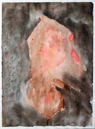
I like both paintings, but not for the same reason i like Rothko's. So that's why i can't consider the exercise entirely successful. The runs and squiggles that resulted from loose watercolour technique are interesting and will probably beg the viewer to "interpret" them as if they were purposeful. They look like landscapes to me. I want the colours to be something more than they are here. Next time i'll go slower and apply multiple layers.

Tuesday, April 14, 2009

Mixed up Slazenger


I made this painting in response to a call for submissions by the Alberta Sports Council. It's a tennis player, but that's not obvious to everyone, so i hope they will like it and see it's relavent.

To make this one, i firstly used green painters tape to block out the area that would be the ball. Then i painted the racket area around it. The person was blocked-in with pale cadmium red. Then the round and box shapes were roughed-in in blue. I wanted them to lead the eye back to the racket and ball and create a repetitive rhythm of the ball. Even though extra layers of all the shapes were made after the first layer was dry, it still didn't pop and looked flat. So finally i wetted the whole paper and used a black Derwent coloured pencil to outline the shapes. I finally removed the green painters tape and splashed in the yellow. Plastic food wrap was lay on top the yellow ball shape as it dried. When it was dry the wrap was removed and I filled-in the wrap resulting pale areas with a cadmium yellow. After that was dry, the ball area was wetted again and the black Derwent pencil outlined the shape.

Monday, April 13, 2009

Great Day

I'm having a great day! It suddenly dawned on me how to make this blog more successful. It's a pretty simple idea, but just a different frame of mind than i had before. If i want this to be a medium for communicating with fellow artists, i have to develop those relationships and then maybe they'll visit here. Before i was just hoping they'd discover this blog. So i'll work on growing relationships.

I also got a couple more calls to show the house that will be vacant in May. Di and i were considering lowering the price because we haven't had any interested renters inquiring over the last couple days. But that slowness was probably on account of the Easter holiday. I'm still confident we can get that place rented on time.

I'm experimenting on the backside of a "unsuccessful" painting. I put vertical green painters tape strips down to keep part of the paper white, and then put wet indian red and burnt umber paint on wet paper in between the stripes. After that dried, i put ivory black and intense blue where the green tape had been.

The whole thing still had a pretty flat tonal range, so ivory black was put over parts of the indian red and burnt umber strips too. I thought it was still lacking something, maybe texture? So i taped plastic food wrap over the paper and tried to drip ivory black paint down the backside of the film wrap between the film and the paper. This added texture on the areas where the paper had buckled from being wet and not being stretched and it touched the film. This created texture horizontally because the paper had buckled horizontally. I also ran my finger nail down the length film over some of the strips and that created even more markings on the paper.

Friday, April 3, 2009

Realism Attempt

Lastnight i was working on this painting. I started by making a drawing with some Derwent water colour pencils. I looked at a photo i'd taken of a friend as the basis for the drawing. I was reasonably happy with the drawing. Then i used a big ol' mob brush to wet the drawing and intended to use cellafilm wrap to add texture. But the probably too wet mop brush erased almost the whole drawing. All the lines diffused and dispersed on the wet paper. So i had to draw it again after the paper dried. I tried using a smaller wet brush to again make it look more like a painting than a pencil crayon drawing. Again it diffused too much, even though i used a significantly drier and smaller brush. So i tried applying the Derwent water colour pencils to the wet paper and it left larger more permanent markings that didn't diffuse with brushwork. These are the markings that are visable now. The whole thing wasn't as pleasing as my original drawing, so i was quite disappointed. It was bed time, so i thought WTF i might as well try something else, so i used the big brush and some dark blue and black paint and applied broad strokes around the eyes, nose and mouth. It didn't look too bad. When i looked at it this morning, i was really pleased with it. It doesn't look close enough to my original photo of my friend to be recognizable though, so in that respect i'm pretty disappointed, even though i'm quite happy with the colour and styling. I photoshopped a picture of the painting and enlarged the eyes, nose and mouth and that looks a little more like the friend. But the original painting is finished the way it is.


First Day

Today is the first day of the rest of my life. Haha, that is pretty cliche sounding, but so true. Too bad words of wisdom are so familiar they don't seem very insightful. Like the main point of every book on becoming wealthy is save 10% of your salary. Whenever i hear it, i'm like yeah, yeah what else do have to say? Maybe if i would just do that and stop looking for something easier or maybe more secretive, or i don't know why everyone just doesn't do it? Requires discipline i guess? Anyway getting back to the point is that today i'm a painter.

I've been painting the last couple evenings, and had a couple pretty successful paintings come from it. I'd like to keep it up. It seems purposeful. That i'm just not wasting days, nights, weeks waiting for my next vacation. That sounds pretty bad reading it back. Like i don't have a good relationship with my partner. Well i'm probably guilty of not trying hard enough sometimes and that's why it sounds so bad. But everyone needs alone time and it would be good if it doesn't feel wasted.

So doing these last couple paintings makes me want to continue on a regular basis. I don't know how acclaimed this work will be, but if i put in my previously mentioned 10,000 hours, i should become somewhat proficient, at least to myself. I am a painter.

Off again on a tangent, which i feel at ease doing because my audience here is so easy going, I wonder when people say "just be yourself" when performing, or producing some sort of art, that if some people are more commercially viable being themselves than others. I mean obviously the king of pop appeals to more people than the guy in the park spinning around in circles and howling at the tree tops, but is Oprah being herself when she does her favourite things show or book club selections, which produce obvious kickback opportunities. I've heard if you're not yourself, people will know you're ingenuine, if not consciously then intuitively just not like you.

Can i name drop paper or paint brands in my painting blog and still be myself and potentially get some kick backs like Oprah, or is that kind of thing ingenuine? Maybe it depends on how much i really love a paint brand. And also if my audience likes my work, and would like to know how i did it? But is that being me, or is it ingenuine? Maybe people like Oprah or Rachel Ray are great successes because they are genuine and genuinely a commercial success, but perhaps other folks who are being themselves just aren't succeeding because there is no commercial component to their self. What if someone is great and people love that genuine person, but they started plugging something? Would that make them ingenuine and turn those who previously loved them off?

Monday, January 19, 2009

Silent Auction

I talked with my buddy Darren down at Divine in Okotoks again about when i could put my paintings up for a silent auction to raise money for breast cancer. He said i could have some hallway space, but a whole restaurant show would have to be a year or so away. Some other artists are queued up. That might work out best because we could have just a few pieces up at a time for auction, and when a month is over put some other works up in their place. Most of the artists' work stays up for 6 months, and i don't think that would be an appropriate duration for a silent auction. It would be nice to have the whole place, but given my limited number of works maybe this is the best way to go until i have lots of stuff ready to fill the restaurant.

Friday, January 9, 2009

Warm Window

For this painting i'm starting with a photograph. I'm not too sure if the photographer needs credit or if i need permission? I usually use my own pics as inspiration. But i doubt i need to so that's what i'll assume.

I modified the photo in photoshop by using the "cutout" button, which reduced the photo to four colours without any blending. Kind of a paint-by-numbers look.

But i want to use an art deco kind of colour palette, so i found a nice art deco poster, and sampled some colours from it and filled in my modified photo with these colours. I'm not completely confident this palette suits the subject matter, but it's pretty abstract and the subject might be lost to most people. So i'll give it a whirl.
The plan is to do a line drawing on my sheet of paper and fill in the shapes with colour and not blend but keep a crisp line between shapes. I'll try as best i can, being red/green colour blind, to match the colours in my modified photo by applying multiple layers of each colour. That is, i won't blend the paints on my palette, but try to achieve the proper tints by layering washes on top of one another.

Update: January 15/09
I worried about doing the sketch. The proportions of the altered photograph are different than my paper size. The photo is more squarish than rectangular. It didn't turn out to be an issue though. I put the window lines at roughly 1/3 and 2/3 of the sheet and again about 1/3 up from the bottom and then took a stab at fitting everything from the photo roughly onto the sheet. I struggled a little bit trying to get the woman's bottom just right and finally resorted to drawing a grid on that part of the photo and another on that section of the paper to get her shape just like in the photo.

I tried to pick a red colour based on the warmth/coolness and realized several layers of washes would have to be applied to get the proper tone. The rest of the colours were also picked using this criteria.
Obviously the dark background in the photo was more purplish than the blue that was going on in the painting, so after the blue wash dried, i put a red wash over it. This purple looked too red when dry, so i again put another layer of blue. This same process was used to try and achieve the tint of the blackish area at the bottom of the painting so it matched the altered photo. Many layers of washes of varying tints were applied.

At one point i decided a blue wash was necessary over the blue and red areas so i painted over both sections at the same time. I don't like the way that idea worked because some of the dried blue and red was lifted with the new wet wash and mixed with the neighbouring colours. So unless that effect is desired, i'd paint over each colour individually. I finally put black wash over much of the darker areas but i applied it over each color one at a time so the red wasn't transferred into the purple or visa verso.
I'm pretty happy with the result. It's looking a bit too paint-by-numberish for my taste, but i like that similar tones and tints were achieved as the altered photo. It might look really smart with a silver metallic frame. I'll try to pick one up from Ikea soon.

When i wasn't working on this or waiting for a layer of wash to dry, i was setting the piece upside down on the easel because i wasn't sure if Di realized the subject was a derrière, and she isn't usually too fond of any nudity or even painting girls with clothes on. So i was hoping this was too abstract for her to decipher. I was almost done though when she made some comment on the colour of the woman, so it turns out she knew what it was after all. She likes it too. Go figure. Women are complicated.

Wednesday, January 7, 2009

Amanda


I quite like the way this one turned out. I've had a funny array of comments on facebook regarding it.

To create this one, i started with a photograph of my friend Amanda and manipulated it in photoshop. I used the "cutout" button with 4 levels and it looked pretty abstract; just like a bunch of shapes. I printed that and referred to it generally as i painted these shapes.

I may have given this one away. If not, i think i will use it in my silent auction at Divine in Okotoks to raise money to fight breast cancer.

Tuesday, January 6, 2009

Silent Auction

My esposa was urging me to tell our friend about my plan to have a silent auction to raise money for breast cancer. We were all watching the hockey game lastnight and it did not seem like the appropriate time. I don't want to be painted with any saintly light, when especially i'm so far from accomplishing my goal. On the other hand, it might be nice for our friend to know we all want to do what we can to support her and ensure a win. It might also be nice to take her to Divine in Okotoks and surprise her with what i'm doing. I don't know when or if i should tell.

Our friend saw the surgeon yesterday but i didn't converse with her about it as much as the esposa did. Apparently she's considering a double mastectomy even though one breast is clear and has an independent likelihood of developing cancer from the other one. This consideration is probably a reflection of how stressful and how out she wants this thing. Indeed she and her partner said their lives seemed to be flashing before their eyes, referring to so many decisions they were facing.

I wish hours of hard labour was all it took beat this thing. Then i have no question we'd win. At any rate i'm sure everyone will do what they can. I've decided to set aside non-negotiable hours to devote to painting.

Monday, January 5, 2009

Headshot

I'm making another attempt at my headshot abstract painting. This time a number of little study paintings were done until a reasonably pleasing design was achieved. The two primary colours were picked utilizing the blue and yellow mixing study (see the previous post). I liked the way Prussian blue and Cad yellow combined. I wanted one of the colours to be warm and the other cooler to get a yin yang thing going on. But i also wanted the blues and greens to be a little bit representative of the subject's eye colour. I'm not sure if either of these objectives were met, but i'll save judgement until the end.

I've been having a hard time making any progress on this project in the last few days. Perhaps it's a function of the holidays or maybe non-negotiable time will have to be scheduled specifically for painting. I want to get a portfolio together for the restaurant auction asap.


Update: January 7, 2009

Yellow strokes were added over the first wash of blue strokes. Then i decided the big opening in the centre needed some horizontal action. I still don't disagree with that, however as soon as i put the horizontal blue strokes in the centre of the painting i was kicking myself. I should have been more careful and put some compositional thought into it. After that dried, i added some yellow underneath the horizontal blue to try and move the centre of that mess downward, unsuccessfully.

I added another blue layer vertically to try and fill in that centre hole and repeat the vertical curvy line left of centre. But the horizontal line still stuck out like a sore thumb.

I filled in some of the white negative space with a very diffuse yellow wash to try and take the bright edge off. Then i wanted to add some black to the most predominate gestures to fill in the darker side of a full tonal range, to have a complete tonal range in each gesture. Then I decided to move the whole key of the painting to dark and blue.

I washed off paint along the sides of the gestures trying again to add tonal depth to the gestures.

I'm pretty happy with it now, however i think it needs something in top right to balance the painting, and i'm going to try and wash off more of that horizontal stroke in the centre.

Update: January 8, 2009
Those few horizontal brushstrokes in the middle are causing the most trouble in this painting. I re-wetted the paper and tried moving the paint around to "erase" them. I then had to reinforce the vertical lines that were over the horizontal ones. That wasn't as successful as i hoped. Then i took a plastic eraser to the offensive parts and again had to re-apply paint to the vertical strokes. I think the horizontal part isn't sticking out as much as a couple days ago. After applying so much dark tones on the vertical marks over the horizontal line, i think the whole thing is now looking tonally flat. I also made a dark horizontal line in the top right corner to add a little more balance.
I splatted some Prussian blue on the light area at the top, and quite liked that. I then splatted water on the middle and lower third hoping to get more interesting texture to compensate for the whole thing still looking flat. But that didn't do much. So i went back to the old crutch and applied yellowish wash onto the entire surface of a big piece of cellophane film and lay that on top of the entire painting. I let that dry before removing it. It's done.
I asked Di if she liked it, and she said "no". I chuckled inside. This girl is brutally honest; to a fault sometimes. I guess it's not really a fault, just brutal. And given a choice I'd rather hear the truth than have a friend awkwardly lie. I think the photo of the painting looks better and is more vibrant than the actual painting. Maybe i should spray glossy fixer on it? I don't like the painting either, so Di and i are in agreement. I'll keep it, but hopefully i'll come up with some better stuff for the auction.