
Showing posts with label water colour. Show all posts
Showing posts with label water colour. Show all posts
Saturday, September 22, 2012
Rorschach Card

Thursday, September 20, 2012
Plastic Wrap Abstract
I wasn't painting anything in particular. Hardly a plan. Abstract expressionism. This is the result.

It looks rather cold. My wife sees a person. I asked who, but she must have known I was teasing and didn't answer. It wasn't my intention to paint a figure.
The technique was to paint the entire sheet yellow, then lay wrinkled plastic wrap on top the yellow paint. The painting was stood upright and very wet runny grey and blue paint was made to run down the wrinkles under the wrap. This was allowed to set for 30 minutes or so, and then the wrap was taken off, washed under a faucet and layed on the painting again. Then violet paint was run under the wrinkles. This set for another 30 minutes and then wrap removed to let the paper dry.
Update 21-Sep-12:
So I said I was happy with the painting. But not over the moon. And I'd taken a picture of it. So why not give it another treatment. So I wet the paper again and let some runny cad yellow run under the wrinkles. When that dried, some spots were wet and lifted. Many of the edges look softer from the additional washes.
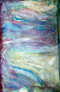

11x17" watercolour
It looks rather cold. My wife sees a person. I asked who, but she must have known I was teasing and didn't answer. It wasn't my intention to paint a figure.
The technique was to paint the entire sheet yellow, then lay wrinkled plastic wrap on top the yellow paint. The painting was stood upright and very wet runny grey and blue paint was made to run down the wrinkles under the wrap. This was allowed to set for 30 minutes or so, and then the wrap was taken off, washed under a faucet and layed on the painting again. Then violet paint was run under the wrinkles. This set for another 30 minutes and then wrap removed to let the paper dry.
Update 21-Sep-12:
So I said I was happy with the painting. But not over the moon. And I'd taken a picture of it. So why not give it another treatment. So I wet the paper again and let some runny cad yellow run under the wrinkles. When that dried, some spots were wet and lifted. Many of the edges look softer from the additional washes.

I'm still not over the moon about it. But I like it. I don't think it's going to be improved with any more similar treatments. It would take a major renovation to blow my hair back
Monday, January 24, 2011
Mountain Lake Abstract
I started this painting trying to stencil some curved marks onto the paper. They looked okay but i wasn't sure how i'd make a whole painting from this technique. So i quickly started using the brush full on.

I was probably using too watery a mixture because the painting was starting to look too greyish without any depth. I wanted some hard lines and texture so i put on the plastic wrap again.
I like how the black trickled down the wet wrap, so i covered the whole painting using this technique. Then the board was flipped over and red was applied in the same manner.
After drying it and flipping around to see which way it looks best, i settled on the vertical aspect. It looks a little like a mountain scene with a lake and red sunset reflections in the foreground.
I'm sorry the video has poor lighting. I started it in the late afternoon and most of the light was coming in the window. But by the time it was finished the lighting was tungsten so the white balance is wrong.
Tuesday, January 18, 2011
Closeup Portrait
I'm pretty happy with how this painting turned out. I didn't do any planning or sketching but carved out the face as I went along. It's a bit of a surprise the proportions are more or less okay. It looked better wet than after it dried though. There is probably a fixer or something i can spray on it to look wet? The nose looks a little too straight on and should probably be pointing more to the left. But maybe she is an ex-hockey player and it's bent out of shape? That's the story i'll go with. Overall I still like it.

Saturday, January 8, 2011
Fire Abstract

I'm REALLY happy with the way this one turned out. I used a combination of paint and colored chalk. I smeared the chalk on while the paper was still wet, and then brushed that into the painting again. Then i laid clear film on the lower half of the painting for texture. If i could duplicate these results i'd make 100 more paintings like this.
Actually I've been working on a different technique today. Results were not expected but I'll save that for when I post that work.
It's been a good day overall. I've kept the tv off even though i don't watch it closely when it's on. Today seems more productive than usual. I'm thinking tv is more of a distraction than i've admitted. I've even worked out somewhat intensely, which is a huge turn around to the trend.
Friday, December 24, 2010
Art Deco Painting

I don't think this is what most people would consider "art deco." It's much too sloppy with errant brush strokes and paint runs. But the colours make me think of art deco. I love how bold they are.
I don't know why i feel the need to classify or label different paintings? In my last post i wondered if my painting was "abstract expression?" I looked up that label and it said something about being anarchic, which isn't a feeling i had about those paintings. So i was probably wrong calling them abstract expression.
Joy to the World!
Friday, April 3, 2009
First Day
Today is the first day of the rest of my life. Haha, that is pretty cliche sounding, but so true. Too bad words of wisdom are so familiar they don't seem very insightful. Like the main point of every book on becoming wealthy is save 10% of your salary. Whenever i hear it, i'm like yeah, yeah what else do have to say? Maybe if i would just do that and stop looking for something easier or maybe more secretive, or i don't know why everyone just doesn't do it? Requires discipline i guess? Anyway getting back to the point is that today i'm a painter.
I've been painting the last couple evenings, and had a couple pretty successful paintings come from it. I'd like to keep it up. It seems purposeful. That i'm just not wasting days, nights, weeks waiting for my next vacation. That sounds pretty bad reading it back. Like i don't have a good relationship with my partner. Well i'm probably guilty of not trying hard enough sometimes and that's why it sounds so bad. But everyone needs alone time and it would be good if it doesn't feel wasted.
So doing these last couple paintings makes me want to continue on a regular basis. I don't know how acclaimed this work will be, but if i put in my previously mentioned 10,000 hours, i should become somewhat proficient, at least to myself. I am a painter.
Off again on a tangent, which i feel at ease doing because my audience here is so easy going, I wonder when people say "just be yourself" when performing, or producing some sort of art, that if some people are more commercially viable being themselves than others. I mean obviously the king of pop appeals to more people than the guy in the park spinning around in circles and howling at the tree tops, but is Oprah being herself when she does her favourite things show or book club selections, which produce obvious kickback opportunities. I've heard if you're not yourself, people will know you're ingenuine, if not consciously then intuitively just not like you.
Can i name drop paper or paint brands in my painting blog and still be myself and potentially get some kick backs like Oprah, or is that kind of thing ingenuine? Maybe it depends on how much i really love a paint brand. And also if my audience likes my work, and would like to know how i did it? But is that being me, or is it ingenuine? Maybe people like Oprah or Rachel Ray are great successes because they are genuine and genuinely a commercial success, but perhaps other folks who are being themselves just aren't succeeding because there is no commercial component to their self. What if someone is great and people love that genuine person, but they started plugging something? Would that make them ingenuine and turn those who previously loved them off?
I've been painting the last couple evenings, and had a couple pretty successful paintings come from it. I'd like to keep it up. It seems purposeful. That i'm just not wasting days, nights, weeks waiting for my next vacation. That sounds pretty bad reading it back. Like i don't have a good relationship with my partner. Well i'm probably guilty of not trying hard enough sometimes and that's why it sounds so bad. But everyone needs alone time and it would be good if it doesn't feel wasted.
So doing these last couple paintings makes me want to continue on a regular basis. I don't know how acclaimed this work will be, but if i put in my previously mentioned 10,000 hours, i should become somewhat proficient, at least to myself. I am a painter.
Off again on a tangent, which i feel at ease doing because my audience here is so easy going, I wonder when people say "just be yourself" when performing, or producing some sort of art, that if some people are more commercially viable being themselves than others. I mean obviously the king of pop appeals to more people than the guy in the park spinning around in circles and howling at the tree tops, but is Oprah being herself when she does her favourite things show or book club selections, which produce obvious kickback opportunities. I've heard if you're not yourself, people will know you're ingenuine, if not consciously then intuitively just not like you.
Can i name drop paper or paint brands in my painting blog and still be myself and potentially get some kick backs like Oprah, or is that kind of thing ingenuine? Maybe it depends on how much i really love a paint brand. And also if my audience likes my work, and would like to know how i did it? But is that being me, or is it ingenuine? Maybe people like Oprah or Rachel Ray are great successes because they are genuine and genuinely a commercial success, but perhaps other folks who are being themselves just aren't succeeding because there is no commercial component to their self. What if someone is great and people love that genuine person, but they started plugging something? Would that make them ingenuine and turn those who previously loved them off?
Monday, January 5, 2009
Headshot
I'm making another attempt at my headshot abstract painting. This time a number of little study paintings were done until a reasonably pleasing design was achieved. The two primary colours were picked utilizing the blue and yellow mixing study (see the previous post). I liked the way Prussian blue and Cad yellow combined. I wanted one of the colours to be warm and the other cooler to get a yin yang thing going on. But i also wanted the blues and greens to be a little bit representative of the subject's eye colour. I'm not sure if either of these objectives were met, but i'll save judgement until the end.


I've been having a hard time making any progress on this project in the last few days. Perhaps it's a function of the holidays or maybe non-negotiable time will have to be scheduled specifically for painting. I want to get a portfolio together for the restaurant auction asap.


Update: January 7, 2009


Yellow strokes were added over the first wash of blue strokes. Then i decided the big opening in the centre needed some horizontal action. I still don't disagree with that, however as soon as i put the horizontal blue strokes in the centre of the painting i was kicking myself. I should have been more careful and put some compositional thought into it. After that dried, i added some yellow underneath the horizontal blue to try and move the centre of that mess downward, unsuccessfully.


I added another blue layer vertically to try and fill in that centre hole and repeat the vertical curvy line left of centre. But the horizontal line still stuck out like a sore thumb.


I filled in some of the white negative space with a very diffuse yellow wash to try and take the bright edge off. Then i wanted to add some black to the most predominate gestures to fill in the darker side of a full tonal range, to have a complete tonal range in each gesture. Then I decided to move the whole key of the painting to dark and blue.


I washed off paint along the sides of the gestures trying again to add tonal depth to the gestures.


I'm pretty happy with it now, however i think it needs something in top right to balance the painting, and i'm going to try and wash off more of that horizontal stroke in the centre.


I've been having a hard time making any progress on this project in the last few days. Perhaps it's a function of the holidays or maybe non-negotiable time will have to be scheduled specifically for painting. I want to get a portfolio together for the restaurant auction asap.


Update: January 7, 2009


Yellow strokes were added over the first wash of blue strokes. Then i decided the big opening in the centre needed some horizontal action. I still don't disagree with that, however as soon as i put the horizontal blue strokes in the centre of the painting i was kicking myself. I should have been more careful and put some compositional thought into it. After that dried, i added some yellow underneath the horizontal blue to try and move the centre of that mess downward, unsuccessfully.


I added another blue layer vertically to try and fill in that centre hole and repeat the vertical curvy line left of centre. But the horizontal line still stuck out like a sore thumb.


I filled in some of the white negative space with a very diffuse yellow wash to try and take the bright edge off. Then i wanted to add some black to the most predominate gestures to fill in the darker side of a full tonal range, to have a complete tonal range in each gesture. Then I decided to move the whole key of the painting to dark and blue.


I washed off paint along the sides of the gestures trying again to add tonal depth to the gestures.


I'm pretty happy with it now, however i think it needs something in top right to balance the painting, and i'm going to try and wash off more of that horizontal stroke in the centre.
Update: January 8, 2009
Those few horizontal brushstrokes in the middle are causing the most trouble in this painting. I re-wetted the paper and tried moving the paint around to "erase" them. I then had to reinforce the vertical lines that were over the horizontal ones. That wasn't as successful as i hoped. Then i took a plastic eraser to the offensive parts and again had to re-apply paint to the vertical strokes. I think the horizontal part isn't sticking out as much as a couple days ago. After applying so much dark tones on the vertical marks over the horizontal line, i think the whole thing is now looking tonally flat. I also made a dark horizontal line in the top right corner to add a little more balance.


I splatted some Prussian blue on the light area at the top, and quite liked that. I then splatted water on the middle and lower third hoping to get more interesting texture to compensate for the whole thing still looking flat. But that didn't do much. So i went back to the old crutch and applied yellowish wash onto the entire surface of a big piece of cellophane film and lay that on top of the entire painting. I let that dry before removing it. It's done.


I asked Di if she liked it, and she said "no". I chuckled inside. This girl is brutally honest; to a fault sometimes. I guess it's not really a fault, just brutal. And given a choice I'd rather hear the truth than have a friend awkwardly lie. I think the photo of the painting looks better and is more vibrant than the actual painting. Maybe i should spray glossy fixer on it? I don't like the painting either, so Di and i are in agreement. I'll keep it, but hopefully i'll come up with some better stuff for the auction.

Friday, January 2, 2009
Blue and Yellow
Here is another study of different yellows and blues mixing together. I suppose this kind of experiment should be done over and over because it might make a difference what colour is on top, the paper, or the dilution of the washes.

Monday, December 22, 2008
Red Drip
This painting was made in the first half of 2008. It's pretty big, 20x30ish. I'm really happy with the way it turned out. I only spent one evening working on it. I gave it to my brother as a thank you present for being my best man when i got married this summer.
It's watercolour on drawing paper, so it buckled and waved quite a bit as different areas got wet. That created a bit of an issue when i was trying to frame it, which turned out to be more frustrating than painting it.
The painting process began with flicking red paint on the flat paper. My original intention was to make it a Jackson Pollack-ish style drip painting. I haven't developed a great way to do that with a watercolor brush yet so i wasn't getting enough coverage to create much of a painting.
My next step was to make big really wet blotches and then to tilt the paper so the wet spot would run. I did several blotches in all four directions and ended up with a bit of a multi-paned window pattern.
Then i tried to fill in all the white areas but excluding the area immeadiately around my splatter dots. So in effect the dots would have little white halos. I filled some areas with warmer red and some with a cooler red. I added a bit of blue to some wet red areas to create even cooler areas, but they turned out pretty much blue.
I used a tiny brush so it took at least a couple hours to paint this. But that's about it and how it was created.
When i take pictures of these paintings i need to include a grey card so a colour balance can be done. I wish i had documented the process of the painting, but that's the idea for future paintings.

It's watercolour on drawing paper, so it buckled and waved quite a bit as different areas got wet. That created a bit of an issue when i was trying to frame it, which turned out to be more frustrating than painting it.
The painting process began with flicking red paint on the flat paper. My original intention was to make it a Jackson Pollack-ish style drip painting. I haven't developed a great way to do that with a watercolor brush yet so i wasn't getting enough coverage to create much of a painting.
My next step was to make big really wet blotches and then to tilt the paper so the wet spot would run. I did several blotches in all four directions and ended up with a bit of a multi-paned window pattern.
Then i tried to fill in all the white areas but excluding the area immeadiately around my splatter dots. So in effect the dots would have little white halos. I filled some areas with warmer red and some with a cooler red. I added a bit of blue to some wet red areas to create even cooler areas, but they turned out pretty much blue.
I used a tiny brush so it took at least a couple hours to paint this. But that's about it and how it was created.
When i take pictures of these paintings i need to include a grey card so a colour balance can be done. I wish i had documented the process of the painting, but that's the idea for future paintings.
Thursday, December 18, 2008
Gift
My plan is to blog all the stages of a painting. But this latest painting was pretty much done before i started the blog. I didn't document the beginning stages. This photo was the almost complete version.

The painting is a Christmas gift for my sister-in-law. I'm not entirely pleased with how it turned out. I'd have liked to make the top part of the tongue rounder than flat, and have the right ear higher on the head, and probably make the shape of the head a little rounder than oval. But it's supposed to be somewhat abstract and not necessarily immediately recognizable, so it will do as is. Next time i'll have to be sure i'm happy with the drawing before getting on with the painting.
In this painting i experimented with a couple ways of adding texture. In the tongue, i put down some pinks and blacks in wet paint, and then lay cellophane that was kind of wrinkly in the wet paint. I pulled the cellophane off when the paint was dry. I wish i hadn't put so much black in the mix and only used pink and white for the tongue.
To make the trees in the background, i lay the cellophane down and scooted several colours under it and then waited for the paint to dry before lifting off the wrap.
For the hair on the cheeks and the grass, i made some hard scratches on the paper with a pallet knife to represent individual hairs and blades of grass. I'm not entirely pleased with that either. Maybe i should try making lighter scratches and doing several layers of scratches and paint and let it dry between each application?

The final version differs from the earlier photo because i painted over the white fence with green grass paint and blended the trees with wet green paint as well. I didn't want the white fence to pop so much. I also added a layer of reddish paint to the body to match the colour of the head better.
Dianne marvelled at how much better it looks framed. I agree. Framing anything seems to make a huge improvement.


The painting is a Christmas gift for my sister-in-law. I'm not entirely pleased with how it turned out. I'd have liked to make the top part of the tongue rounder than flat, and have the right ear higher on the head, and probably make the shape of the head a little rounder than oval. But it's supposed to be somewhat abstract and not necessarily immediately recognizable, so it will do as is. Next time i'll have to be sure i'm happy with the drawing before getting on with the painting.
In this painting i experimented with a couple ways of adding texture. In the tongue, i put down some pinks and blacks in wet paint, and then lay cellophane that was kind of wrinkly in the wet paint. I pulled the cellophane off when the paint was dry. I wish i hadn't put so much black in the mix and only used pink and white for the tongue.
To make the trees in the background, i lay the cellophane down and scooted several colours under it and then waited for the paint to dry before lifting off the wrap.
For the hair on the cheeks and the grass, i made some hard scratches on the paper with a pallet knife to represent individual hairs and blades of grass. I'm not entirely pleased with that either. Maybe i should try making lighter scratches and doing several layers of scratches and paint and let it dry between each application?


The final version differs from the earlier photo because i painted over the white fence with green grass paint and blended the trees with wet green paint as well. I didn't want the white fence to pop so much. I also added a layer of reddish paint to the body to match the colour of the head better.
Dianne marvelled at how much better it looks framed. I agree. Framing anything seems to make a huge improvement.
Wednesday, December 17, 2008
Family Canoe
This painting is one of the first attempts at a painting I made for my sister and her family. I'll ask my sister to take a snap of the painting i eventually gave them so you can compare this one and the final version.

This one has a higher viewpoint of the family in the canoe than i cared for. The lower viewpoint in the final version looked more like the perspective of the rear paddler in the canoe. I'm not completely satisfied with the cropping in the final version. But i was under a deadline, so i ran with it
The purpose of the painting was to create a family vision for my sister and her family. Bonnie and Troy adopted two little girls from Ghana. But the Canadian government was dragging their heels granting the girls visas. So the little girls and thus at least one of the adopting parents also had to wait in Africa for the visas to be granted. This painting was meant to be a reinforcing vision of the whole family together in Canada, in a canoe.
Update - Dec 19/08

Here is the version of the painting that i gave to the family. As you can see, it's certainly less abstract and the perspective is a little lower and the girls seem closer. Probably more like you'd see if you were actually in the canoe. It's funny the people look transparent and the water looks more opaque. It should probably be the other way around, seeing how water is usually pretty see through. I wish there was some slight difference between the inside sides of the canoe and the bottom of it. I wouldn't have cropped it so tightly if i could change that too. Oh well, live and learn.

This one has a higher viewpoint of the family in the canoe than i cared for. The lower viewpoint in the final version looked more like the perspective of the rear paddler in the canoe. I'm not completely satisfied with the cropping in the final version. But i was under a deadline, so i ran with it
The purpose of the painting was to create a family vision for my sister and her family. Bonnie and Troy adopted two little girls from Ghana. But the Canadian government was dragging their heels granting the girls visas. So the little girls and thus at least one of the adopting parents also had to wait in Africa for the visas to be granted. This painting was meant to be a reinforcing vision of the whole family together in Canada, in a canoe.
Update - Dec 19/08

Here is the version of the painting that i gave to the family. As you can see, it's certainly less abstract and the perspective is a little lower and the girls seem closer. Probably more like you'd see if you were actually in the canoe. It's funny the people look transparent and the water looks more opaque. It should probably be the other way around, seeing how water is usually pretty see through. I wish there was some slight difference between the inside sides of the canoe and the bottom of it. I wouldn't have cropped it so tightly if i could change that too. Oh well, live and learn.
Subscribe to:
Posts (Atom)