Showing posts with label abstract. Show all posts

Tuesday, October 9, 2012

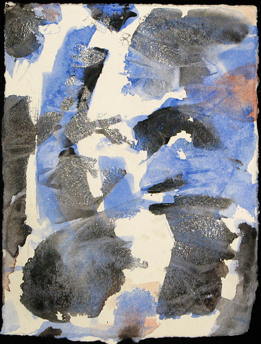
Abstract

11x17"watercolour

I was organizing the office putting paintings into appropriately sized boxes, when I found a couple paintings that I appreciate now more than when they were completed. Pretty sure this is 2012 vintage.

I like the textures within the various colour fields. I also like the transparencies of the orange and blue on the left. I'm not sure what is on top of what and what it means?

Sunday, September 30, 2012

Not Landscape Abstract

Initially, I intended this to be a landscape. I wanted to practice making converging horizontal lines at the top to represent landscape off in the distance. Plastic wrap was lay over the green and red areas and black run under the wrap mixing the green and red. The mixing didn't happen as much as wanted. The darker bottom where the black was poured would represent the foreground and the lighter less contrast top would be the distance. I even gave the top a mauve wash, the colour of distant hills. I was really trying to give it 3D perspective.

Then I asked my friend what he thought of it, and he looked at it vertically. It really looks more interesting vertically than horizontal. So it's not a landscape now, and all that 3D perspective business is for not.

Saturday, September 22, 2012

Thursday, September 20, 2012

Plastic Wrap Abstract

I wasn't painting anything in particular. Hardly a plan. Abstract expressionism. This is the result.
11x17" watercolour

It looks rather cold. My wife sees a person. I asked who, but she must have known I was teasing and didn't answer. It wasn't my intention to paint a figure.

The technique was to paint the entire sheet yellow, then lay wrinkled plastic wrap on top the yellow paint. The painting was stood upright and very wet runny grey and blue paint was made to run down the wrinkles under the wrap. This was allowed to set for 30 minutes or so, and then the wrap was taken off, washed under a faucet and layed on the painting again.  Then violet paint was run under the wrinkles. This set for another 30 minutes and then wrap removed to let the paper dry.

Update 21-Sep-12:
So I said I was happy with the painting. But not over the moon. And I'd taken a picture of it. So why not give it another treatment. So I wet the paper again and let some runny cad yellow run under the wrinkles. When that dried, some spots were wet and lifted. Many of the edges look softer from the additional washes.
I'm still not over the moon about it. But I like it. I don't think it's going to be improved with any more similar treatments. It would take a major renovation to blow my hair back

Monday, September 17, 2012

Abstract Landscape

11x17" watercolour

At first I wasn't sure, but the finished painting is growing on me. I've flipped it upside down, looked at it in the mirror, close, far way. It seems pretty done.

Sunday, September 16, 2012

Work in progress

First did a sketch so I would remember perspective and keep the far away things narrow and the closer parts fat and juicy.

I started painting the far away bits of the tree, the backside of the trunk and the bushy leaf area. Then I painted the closer parts. I realized I should have painted the background first. So next time I'll do that. This is supposed to be a study for a larger project, so in that sense i've learned what to do differently on the big sheet.

Then I put the plastic wrap on the wet part and stood it up against a wall. I loaded my brush with water and applied the water above the painting so it would run down the wrinkles in the plastic wrap. Fingers are crossed, but will probably see something in need of a touch-up.

Thursday, September 13, 2012

Certainly thinking about painting more...

Yes, at least been thinking about painting more. Trying to sneak in a few brush strokes during nap time.

This one was "inspired" by another painting. But not to worry they don't even look remotely similar.

I really like the textures that were achieved on this one. I've been asked to do a big one of a tree, and I think the technique used here is what I'll use for that piece.

The commissioned piece will be less abstract, so I'll do a study to make sure the technique is applicable before using the big sheet of paper.

Geez I forget what that sheet cost. I think it was over $100 for one piece of paper?

Monday, January 24, 2011

Mountain Lake Abstract


I started this painting trying to stencil some curved marks onto the paper. They looked okay but i wasn't sure how i'd make a whole painting from this technique. So i quickly started using the brush full on.

I was probably using too watery a mixture because the painting was starting to look too greyish without any depth. I wanted some hard lines and texture so i put on the plastic wrap again.

I like how the black trickled down the wet wrap, so i covered the whole painting using this technique. Then the board was flipped over and red was applied in the same manner.

After drying it and flipping around to see which way it looks best, i settled on the vertical aspect. It looks a little like a mountain scene with a lake and red sunset reflections in the foreground.

I'm sorry the video has poor lighting. I started it in the late afternoon and most of the light was coming in the window. But by the time it was finished the lighting was tungsten so the white balance is wrong.

Saturday, January 8, 2011

Fire Abstract


I'm REALLY happy with the way this one turned out. I used a combination of paint and colored chalk. I smeared the chalk on while the paper was still wet, and then brushed that into the painting again. Then i laid clear film on the lower half of the painting for texture. If i could duplicate these results i'd make 100 more paintings like this.

Actually I've been working on a different technique today. Results were not expected but I'll save that for when I post that work.

It's been a good day overall. I've kept the tv off even though i don't watch it closely when it's on. Today seems more productive than usual. I'm thinking tv is more of a distraction than i've admitted. I've even worked out somewhat intensely, which is a huge turn around to the trend.

Friday, December 24, 2010

Art Deco Painting


I don't think this is what most people would consider "art deco." It's much too sloppy with errant brush strokes and paint runs. But the colours make me think of art deco. I love how bold they are.

I don't know why i feel the need to classify or label different paintings? In my last post i wondered if my painting was "abstract expression?" I looked up that label and it said something about being anarchic, which isn't a feeling i had about those paintings. So i was probably wrong calling them abstract expression.

Joy to the World!

Thursday, November 18, 2010

Abstract Expression


I was inspired to paint this after seeing a painting on the show "Mad Men." Wow that show has style!

I like the way this one turned out. It's funny how my works always turn out completely different than the works that spurred me. I chose the wrong colours to begin with so i had to layer over some of the first shapes to change their hue.

I really need to paint more. I've improved my process of creating large files and colour correcting for upload to iStock. From what i earn from only a few files suggests that if i add a few hundred more paintings it could be a full time income. Although it's probably naive to make a reasonable extrapolation from such a small sample. Get busy Jones and find out!

Saturday, December 5, 2009

Jong Ro Homage


I really admire the paintings of Jong Ro. I suppose the fact that i like her paintings is enough in itself, but i'm also wanting to learn a lot more about abstract painting. I wonder if there is a theory backgrounder that can be found on the subject, so that i might appreciate abstract much more?

Jong Ro painting.

Monday, January 5, 2009

Headshot

I'm making another attempt at my headshot abstract painting. This time a number of little study paintings were done until a reasonably pleasing design was achieved. The two primary colours were picked utilizing the blue and yellow mixing study (see the previous post). I liked the way Prussian blue and Cad yellow combined. I wanted one of the colours to be warm and the other cooler to get a yin yang thing going on. But i also wanted the blues and greens to be a little bit representative of the subject's eye colour. I'm not sure if either of these objectives were met, but i'll save judgement until the end.

I've been having a hard time making any progress on this project in the last few days. Perhaps it's a function of the holidays or maybe non-negotiable time will have to be scheduled specifically for painting. I want to get a portfolio together for the restaurant auction asap.


Update: January 7, 2009

Yellow strokes were added over the first wash of blue strokes. Then i decided the big opening in the centre needed some horizontal action. I still don't disagree with that, however as soon as i put the horizontal blue strokes in the centre of the painting i was kicking myself. I should have been more careful and put some compositional thought into it. After that dried, i added some yellow underneath the horizontal blue to try and move the centre of that mess downward, unsuccessfully.

I added another blue layer vertically to try and fill in that centre hole and repeat the vertical curvy line left of centre. But the horizontal line still stuck out like a sore thumb.

I filled in some of the white negative space with a very diffuse yellow wash to try and take the bright edge off. Then i wanted to add some black to the most predominate gestures to fill in the darker side of a full tonal range, to have a complete tonal range in each gesture. Then I decided to move the whole key of the painting to dark and blue.

I washed off paint along the sides of the gestures trying again to add tonal depth to the gestures.

I'm pretty happy with it now, however i think it needs something in top right to balance the painting, and i'm going to try and wash off more of that horizontal stroke in the centre.

Update: January 8, 2009
Those few horizontal brushstrokes in the middle are causing the most trouble in this painting. I re-wetted the paper and tried moving the paint around to "erase" them. I then had to reinforce the vertical lines that were over the horizontal ones. That wasn't as successful as i hoped. Then i took a plastic eraser to the offensive parts and again had to re-apply paint to the vertical strokes. I think the horizontal part isn't sticking out as much as a couple days ago. After applying so much dark tones on the vertical marks over the horizontal line, i think the whole thing is now looking tonally flat. I also made a dark horizontal line in the top right corner to add a little more balance.
I splatted some Prussian blue on the light area at the top, and quite liked that. I then splatted water on the middle and lower third hoping to get more interesting texture to compensate for the whole thing still looking flat. But that didn't do much. So i went back to the old crutch and applied yellowish wash onto the entire surface of a big piece of cellophane film and lay that on top of the entire painting. I let that dry before removing it. It's done.
I asked Di if she liked it, and she said "no". I chuckled inside. This girl is brutally honest; to a fault sometimes. I guess it's not really a fault, just brutal. And given a choice I'd rather hear the truth than have a friend awkwardly lie. I think the photo of the painting looks better and is more vibrant than the actual painting. Maybe i should spray glossy fixer on it? I don't like the painting either, so Di and i are in agreement. I'll keep it, but hopefully i'll come up with some better stuff for the auction.

Monday, December 22, 2008

Red Drip


IMG_6346a
Originally uploaded by philsajonesen
This painting was made in the first half of 2008. It's pretty big, 20x30ish. I'm really happy with the way it turned out. I only spent one evening working on it. I gave it to my brother as a thank you present for being my best man when i got married this summer.

It's watercolour on drawing paper, so it buckled and waved quite a bit as different areas got wet. That created a bit of an issue when i was trying to frame it, which turned out to be more frustrating than painting it.

The painting process began with flicking red paint on the flat paper. My original intention was to make it a Jackson Pollack-ish style drip painting. I haven't developed a great way to do that with a watercolor brush yet so i wasn't getting enough coverage to create much of a painting.

My next step was to make big really wet blotches and then to tilt the paper so the wet spot would run. I did several blotches in all four directions and ended up with a bit of a multi-paned window pattern.

Then i tried to fill in all the white areas but excluding the area immeadiately around my splatter dots. So in effect the dots would have little white halos. I filled some areas with warmer red and some with a cooler red. I added a bit of blue to some wet red areas to create even cooler areas, but they turned out pretty much blue.

I used a tiny brush so it took at least a couple hours to paint this. But that's about it and how it was created.

When i take pictures of these paintings i need to include a grey card so a colour balance can be done. I wish i had documented the process of the painting, but that's the idea for future paintings.

Friday, December 19, 2008

Headshot

I started a new painting last night. I still have a lot of room for improvement documenting my processes. I finished a little 4x6ish study without taking pictures of any intermediary steps. I want this painting to be completely abstract, but i started with a head shot of one of my friends.
I marked the paper with green oil pastels to represent the darkest areas of the photo. Then i used a blue oil pastel stick to mark in the areas that are more intermediate tones in the photo. Maybe i should have used cool colours to represent the dark area and neutral temperature colours for the intermediate tones. I already wasn't liking my colour choices or that you could see it was a persons face. So i knew this was a write off. I used a big brush and wetted the paper and then put cellophane wrap over the drawing and lifted off corners of the film one at a time and painted cadmium red water colour on the underside of the film, and then pressed it back down to the paper. This didn't improve my liking of the picture at all. So i used my yellow pallet knife and scraped very hard to move the oil pastel around and mix the blue and green a little. I also used the edge of the knife and made some deep directional grooves. Really this was a complete yucky mess and not at all what i was going for. So i tried again with a 5x7ish sized paper.
I used a big inch sized brush to make some blue marks where the dark areas should be in relation to the photo. I wish i had taken a photo of just the blue strokes. I didn't worry about detail or representation at all. I didn't like the pattern it came out as, so i was already desperate to save it. So i went back to laying the cellophane over the painting and i used a tiny brush and slipped black paint into the edges of the big blue strokes and pressed the film back over that area each time. I continued this and tried to keep the sheet balanced with not one side or top or bottom having more black than the other. It still seemed a little boring, so i added a little bit of red to some blandish spots that were just sort of grey.

When i removed the cellophane this morning, this is what i had. I'm thinking of adding a bit of yellow in to the white areas so there are not so many sharp edges and add a bit of warmth. I'm also going to go over the blue strokes again to hopefully add some dimension. So this picture is already more cluttered than i was hoping for. Obviously i need to do a pencil sketch of where my big blue strokes should go. Lack of a satisfactory initial drawing seems to be a reoccurring issue in my failures.

Update - December 21/08

Yesterday i added some yellow (as seen on the left photo) then i put another layer of blue over the blue strokes and splattered some red paint to try and add more warmth and perhaps another dimension (as seen on the right photo). I don't know why exactly i splattered the red paint, it was just missing something. It's not a completely awful little painting, but it's not something i'll be showing off to everyone either. I think it was mostly just an exercise in trying to make the best of bad planning or sketches? Obviously need to give it another go.

Thursday, December 18, 2008

Gift

My plan is to blog all the stages of a painting. But this latest painting was pretty much done before i started the blog. I didn't document the beginning stages. This photo was the almost complete version.

The painting is a Christmas gift for my sister-in-law. I'm not entirely pleased with how it turned out. I'd have liked to make the top part of the tongue rounder than flat, and have the right ear higher on the head, and probably make the shape of the head a little rounder than oval. But it's supposed to be somewhat abstract and not necessarily immediately recognizable, so it will do as is. Next time i'll have to be sure i'm happy with the drawing before getting on with the painting.

In this painting i experimented with a couple ways of adding texture. In the tongue, i put down some pinks and blacks in wet paint, and then lay cellophane that was kind of wrinkly in the wet paint. I pulled the cellophane off when the paint was dry. I wish i hadn't put so much black in the mix and only used pink and white for the tongue.

To make the trees in the background, i lay the cellophane down and scooted several colours under it and then waited for the paint to dry before lifting off the wrap.

For the hair on the cheeks and the grass, i made some hard scratches on the paper with a pallet knife to represent individual hairs and blades of grass. I'm not entirely pleased with that either. Maybe i should try making lighter scratches and doing several layers of scratches and paint and let it dry between each application?

The final version differs from the earlier photo because i painted over the white fence with green grass paint and blended the trees with wet green paint as well. I didn't want the white fence to pop so much. I also added a layer of reddish paint to the body to match the colour of the head better.

Dianne marvelled at how much better it looks framed. I agree. Framing anything seems to make a huge improvement.