Showing posts with label art. Show all posts

Sunday, October 4, 2015

Moraine Lake

The motivation for this one comes from a day trip to Canmore with the family. I was holding the baby like a football and walking while Di and the boys finished their hot chocolates. She wouldn't stop crying unless I got her away from her mom. She slept once I started walking, and my walking took me into a gallery. It was fascinating how the price of paintings depend mostly on their size. Di and the boys found us and started looking at the artworks too. Di expressed an interest in a big piece. We are so not in a position to buy a big piece of artwork right now.

When I got back to work in Ontario, I started wondering if I could do a big acrylic. My thing is usually watercolour. But a huge watercolour is beyond my competency. Acrylic materials are dirt cheap at Jysk. So I thought I'd give a little acrylic a try before getting a big canvas.
It's not like acrylic is super easy to get a good result. But there is the chance to paint right over mistakes. That's so not the case with watercolours where every brushstroke is permanent.
I added the grass because I thought it needed something in the foreground. But then I changed my mind after a few days. Also getting the perspective right on the canoe required more attention than it got initially.

I'm reasonably happy with this work as it is below. But something may start to annoy me as the grass did. Maybe it needs to be hung upside down or sideways for a few days too?
So producing a big work like Di wanted isn't totally out of the question. The challenge now is if I work on it in my free time in Ontario, how will I get it home to Calgary. Or if I work on it in Calgary, it would be taking precious time away from the family.

Perhaps putting an oversize piece on the flight home isn't as expensive as I imagine?

Monday, September 7, 2015

The Longest Grass

I started a sketch of my son. On the last painting I said the head was too small to get much detail into. This face is only marginally bigger. Maybe the size of a silver dollar rather than a loonie. None the less, I like the sketch so far because the likeness seems to be there.

One thing I'm trying with this sketch is working from a b&w reference photo. I'm hoping it will help get the tones relatively correct with more ease and not being fooled by changes in colour.
I did a crosshatch with the watercolour pencils to add colour to the background. Then I tried to take that texture out with a wet paintbrush and just have a solid colour background. I didn't bother to scrub all lines out.  I figure when I add the grass in with the pencils after the paper dries, it won't be too noticeable 
After the paper dried I added more lines for hair and grass and emphasized the dark part of the eyes, nose, and mouth. 

I'm pretty happy with the end result. There wasn't as much magic if paint is applied on wet paper with a brush. But I'll stick with this technique for a few more paintings and see if it keeps improving. 


Sunday, September 6, 2015

Barefoot on Grass

I'm living away from home so I can work now. I anticipate there will be lots more time available to paint. Of course there is my full time job and I'll keep looking for a job back home. But after that there should be lots of time to paint.

I've been really inspired by Ali Cavanaugh's work. It's figurative paintings of her children. Her results are really remarkable. Of course she has a really skilled and well practiced hand. I'm sure it will take me 10,000 hours to reach her level.

I tried a little portrait of my son. I enjoyed working on it especially because it was my son and my family is so far away right now.

It is an 9x12 inch painting. I started with a sketch using Reeves watercolor pencils. Then I brushed it with water. I kept reworking it to try and get the likeness correct. But I think it looks way overworked  and still the likeness is not correct. Double whammy. Part of the issue was the face was only the size of a loonie and I was trying to do too much in such a small space. My brush is not small enough to maneuver in that tiny area.  Just getting the basics and broad strokes of his face might have been enough. At least not looking overworked.

I'll try it again with a bigger space, maybe the size of a tennis ball to paint the face.

Tuesday, June 3, 2014

Moose

I painted this one pretty quick, three hours, one sitting. It's about 18x24 inches, watercolour on paper.

The difference between the first photo and second is the back of the moose around his hind. I thought it was too ambiguous about how it stood apart from the background, and bigger than intended. So I used an almost dry bristle brush and pushed the background down.

I've taken a bit of grief about painting a realist moose. I chose the subject because I'm going to be showing some paintings at the central library and I'm hoping to sell a couple. All the downtown galleries are stocked with Canadiana. So I picked something there seems to be a market for. Thus the grief.

Anyway, I've been thinking if I did this painting again, I would add something in the foreground to frame the moose and give it more depth. Maybe trees around the edges as a dark frame.

I'm mostly happy with this. I especially like the way the antlers turned out which was truthfully more luck than planned.


Friday, June 28, 2013

Library Exhibit

Louise Riley Library is exhibiting 13 of my watercolour paintings in June and July. Pretty stoked and inspired to submit my work to more galleries when they call for submissions.


Saturday, December 1, 2012

Abstract Expression

11x17" watercolour
The composition for this painting had absolutely no plan before it was started. My son and I were merely scribbling on a blank sheet of paper with watercolour pencils. After he went to bed, I added the big violet area and touches of yellow with a big wet brush.

Sunday, September 30, 2012

Not Landscape Abstract

Initially, I intended this to be a landscape. I wanted to practice making converging horizontal lines at the top to represent landscape off in the distance. Plastic wrap was lay over the green and red areas and black run under the wrap mixing the green and red. The mixing didn't happen as much as wanted. The darker bottom where the black was poured would represent the foreground and the lighter less contrast top would be the distance. I even gave the top a mauve wash, the colour of distant hills. I was really trying to give it 3D perspective.

Then I asked my friend what he thought of it, and he looked at it vertically. It really looks more interesting vertically than horizontal. So it's not a landscape now, and all that 3D perspective business is for not.

Sunday, September 16, 2012

Work in progress

First did a sketch so I would remember perspective and keep the far away things narrow and the closer parts fat and juicy.

I started painting the far away bits of the tree, the backside of the trunk and the bushy leaf area. Then I painted the closer parts. I realized I should have painted the background first. So next time I'll do that. This is supposed to be a study for a larger project, so in that sense i've learned what to do differently on the big sheet.

Then I put the plastic wrap on the wet part and stood it up against a wall. I loaded my brush with water and applied the water above the painting so it would run down the wrinkles in the plastic wrap. Fingers are crossed, but will probably see something in need of a touch-up.

Thursday, September 13, 2012

Certainly thinking about painting more...

Yes, at least been thinking about painting more. Trying to sneak in a few brush strokes during nap time.

This one was "inspired" by another painting. But not to worry they don't even look remotely similar.

I really like the textures that were achieved on this one. I've been asked to do a big one of a tree, and I think the technique used here is what I'll use for that piece.

The commissioned piece will be less abstract, so I'll do a study to make sure the technique is applicable before using the big sheet of paper.

Geez I forget what that sheet cost. I think it was over $100 for one piece of paper?

Monday, March 14, 2011

Horse and Train

I love this painting by Alex Colville!

I tried painting my own version and pretty happy with it. It's definitely not as awesome, but I think the experience of copying is very interesting. I didn't get the horse quite right. In awe of how he captured it's form.

I drew lines over the original to study composition. I noticed how the bottom half of the horse's ass is in shadow and fits under a diagonal intersect and the lighter half of the torso is above the diagonal. Also, the horizon is pretty much two thirds up the paper following the "rule of thirds." Even the smoke from the train follows a diagonal in the NW quadrant. It's very interesting.

Saturday, January 8, 2011

Fire Abstract


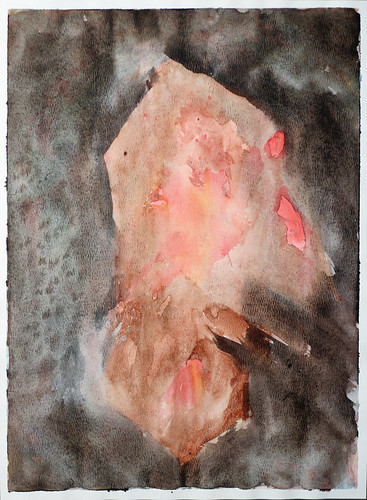
I'm REALLY happy with the way this one turned out. I used a combination of paint and colored chalk. I smeared the chalk on while the paper was still wet, and then brushed that into the painting again. Then i laid clear film on the lower half of the painting for texture. If i could duplicate these results i'd make 100 more paintings like this.

Actually I've been working on a different technique today. Results were not expected but I'll save that for when I post that work.

It's been a good day overall. I've kept the tv off even though i don't watch it closely when it's on. Today seems more productive than usual. I'm thinking tv is more of a distraction than i've admitted. I've even worked out somewhat intensely, which is a huge turn around to the trend.

Friday, December 24, 2010

Art Deco Painting


I don't think this is what most people would consider "art deco." It's much too sloppy with errant brush strokes and paint runs. But the colours make me think of art deco. I love how bold they are.

I don't know why i feel the need to classify or label different paintings? In my last post i wondered if my painting was "abstract expression?" I looked up that label and it said something about being anarchic, which isn't a feeling i had about those paintings. So i was probably wrong calling them abstract expression.

Joy to the World!

Friday, June 4, 2010

The Photo's Impression


I finished this painting last night. It's been a work in process for a few weeks now. It was getting muddier and muddier as each new layer was applied, and further from having any dynamic range. It was looking very dark grey and monotone.

So i thought "what the hell" and washed as much as would come off in the kitchen sink. I was left with a slightly lighter green colour block devoid of any shapes or patterns. Then i roughly sketched a scene from a group of seven painting with watercolour pencils onto the wet paper. I quite like the result.

The photo (above) i took of the painting seems to have a much greater tonal range from the light areas to the dark darks than how the painting looks in real life. And more colorful too. If i sold this painting online, the photo would definitely have to be darkened and desaturated to more closely resemble how i see the real painting. Otherwise i think the photo would be a misrepresentation of the painting. Maybe i just remember it under bad light? I've altered the photo to resemble how i remember the painting (below).

Then there is the issue of how i'd really like it to be. So i went to town in Photoshop and adjusted the tonal curves and saturation quite a bit. The image below is the one i prefer. I might have a large print made from this variation and see how it compares to the original painting. I wonder if Photoshop needs to be how i finish all my work and only sell prints. The original painting perhaps trashed as inferior?
June 16th Update:
Istockphoto rejected the version that i considered "final" (above) for being too dark. So i lightened it up, and resubmitted it (below).

Monday, November 23, 2009

Pool Shark Attack continued

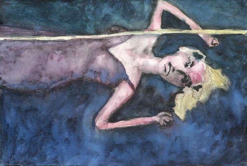
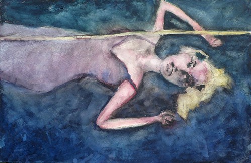
I've had enough of this painting. I really don't think i can fix it up so i'll love it. Maybe if i took a fine brush and detailed the hands and face? But that's not going to happen. The law of diminishing returns rules.

another iteration


yet another iteration


finished

Tuesday, November 10, 2009

Bodhi Tree continued


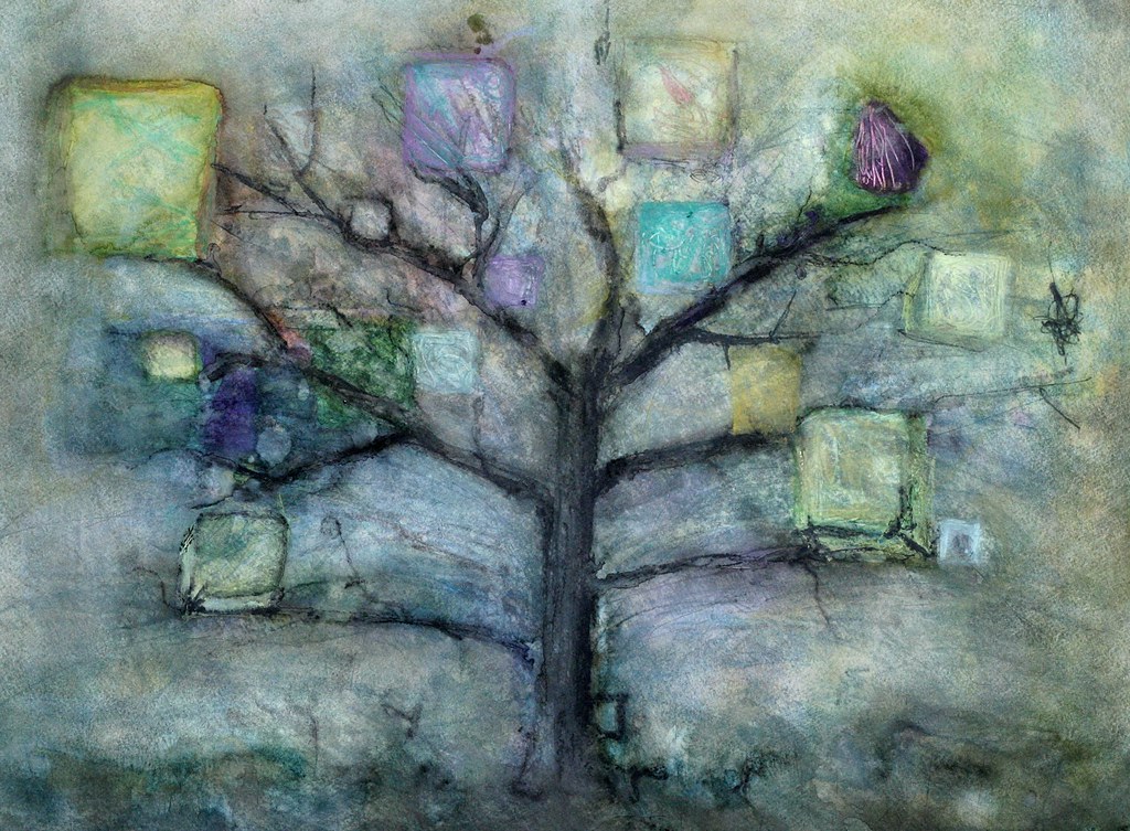
Lastnight I worked on the same sheet of paper that seemed ruined on Sunday. I tried to add colour blocks to represent the big areas of leaves on a tree. I wetted the paper and lifted the old paint and painted in the new yellow or blue. I thought this piece was beyond repair, but now i'm quite liking it again.

I think there is too much negative space around the tree in the sky area, but i plan to crop over that area with the matte from the frame i have in mind.

I'm not sure if it's done now? I think i'll have to walk by it and glimpse it, or put it upside down to see if it seems balanced.

The actual painting doesn't have as much pop or saturation as this photo. But it may look better in the photo and i'm going to upload it to istockphoto, so i didn't dial down the colour saturation to make a truer representation of the painting.

Monday, April 13, 2009

Great Day

I'm having a great day! It suddenly dawned on me how to make this blog more successful. It's a pretty simple idea, but just a different frame of mind than i had before. If i want this to be a medium for communicating with fellow artists, i have to develop those relationships and then maybe they'll visit here. Before i was just hoping they'd discover this blog. So i'll work on growing relationships.

I also got a couple more calls to show the house that will be vacant in May. Di and i were considering lowering the price because we haven't had any interested renters inquiring over the last couple days. But that slowness was probably on account of the Easter holiday. I'm still confident we can get that place rented on time.

I'm experimenting on the backside of a "unsuccessful" painting. I put vertical green painters tape strips down to keep part of the paper white, and then put wet indian red and burnt umber paint on wet paper in between the stripes. After that dried, i put ivory black and intense blue where the green tape had been.

The whole thing still had a pretty flat tonal range, so ivory black was put over parts of the indian red and burnt umber strips too. I thought it was still lacking something, maybe texture? So i taped plastic food wrap over the paper and tried to drip ivory black paint down the backside of the film wrap between the film and the paper. This added texture on the areas where the paper had buckled from being wet and not being stretched and it touched the film. This created texture horizontally because the paper had buckled horizontally. I also ran my finger nail down the length film over some of the strips and that created even more markings on the paper.

Friday, April 3, 2009

First Day

Today is the first day of the rest of my life. Haha, that is pretty cliche sounding, but so true. Too bad words of wisdom are so familiar they don't seem very insightful. Like the main point of every book on becoming wealthy is save 10% of your salary. Whenever i hear it, i'm like yeah, yeah what else do have to say? Maybe if i would just do that and stop looking for something easier or maybe more secretive, or i don't know why everyone just doesn't do it? Requires discipline i guess? Anyway getting back to the point is that today i'm a painter.

I've been painting the last couple evenings, and had a couple pretty successful paintings come from it. I'd like to keep it up. It seems purposeful. That i'm just not wasting days, nights, weeks waiting for my next vacation. That sounds pretty bad reading it back. Like i don't have a good relationship with my partner. Well i'm probably guilty of not trying hard enough sometimes and that's why it sounds so bad. But everyone needs alone time and it would be good if it doesn't feel wasted.

So doing these last couple paintings makes me want to continue on a regular basis. I don't know how acclaimed this work will be, but if i put in my previously mentioned 10,000 hours, i should become somewhat proficient, at least to myself. I am a painter.

Off again on a tangent, which i feel at ease doing because my audience here is so easy going, I wonder when people say "just be yourself" when performing, or producing some sort of art, that if some people are more commercially viable being themselves than others. I mean obviously the king of pop appeals to more people than the guy in the park spinning around in circles and howling at the tree tops, but is Oprah being herself when she does her favourite things show or book club selections, which produce obvious kickback opportunities. I've heard if you're not yourself, people will know you're ingenuine, if not consciously then intuitively just not like you.

Can i name drop paper or paint brands in my painting blog and still be myself and potentially get some kick backs like Oprah, or is that kind of thing ingenuine? Maybe it depends on how much i really love a paint brand. And also if my audience likes my work, and would like to know how i did it? But is that being me, or is it ingenuine? Maybe people like Oprah or Rachel Ray are great successes because they are genuine and genuinely a commercial success, but perhaps other folks who are being themselves just aren't succeeding because there is no commercial component to their self. What if someone is great and people love that genuine person, but they started plugging something? Would that make them ingenuine and turn those who previously loved them off?

Monday, January 19, 2009

Silent Auction

I talked with my buddy Darren down at Divine in Okotoks again about when i could put my paintings up for a silent auction to raise money for breast cancer. He said i could have some hallway space, but a whole restaurant show would have to be a year or so away. Some other artists are queued up. That might work out best because we could have just a few pieces up at a time for auction, and when a month is over put some other works up in their place. Most of the artists' work stays up for 6 months, and i don't think that would be an appropriate duration for a silent auction. It would be nice to have the whole place, but given my limited number of works maybe this is the best way to go until i have lots of stuff ready to fill the restaurant.

Friday, January 9, 2009

Warm Window

For this painting i'm starting with a photograph. I'm not too sure if the photographer needs credit or if i need permission? I usually use my own pics as inspiration. But i doubt i need to so that's what i'll assume.

I modified the photo in photoshop by using the "cutout" button, which reduced the photo to four colours without any blending. Kind of a paint-by-numbers look.

But i want to use an art deco kind of colour palette, so i found a nice art deco poster, and sampled some colours from it and filled in my modified photo with these colours. I'm not completely confident this palette suits the subject matter, but it's pretty abstract and the subject might be lost to most people. So i'll give it a whirl.
The plan is to do a line drawing on my sheet of paper and fill in the shapes with colour and not blend but keep a crisp line between shapes. I'll try as best i can, being red/green colour blind, to match the colours in my modified photo by applying multiple layers of each colour. That is, i won't blend the paints on my palette, but try to achieve the proper tints by layering washes on top of one another.

Update: January 15/09
I worried about doing the sketch. The proportions of the altered photograph are different than my paper size. The photo is more squarish than rectangular. It didn't turn out to be an issue though. I put the window lines at roughly 1/3 and 2/3 of the sheet and again about 1/3 up from the bottom and then took a stab at fitting everything from the photo roughly onto the sheet. I struggled a little bit trying to get the woman's bottom just right and finally resorted to drawing a grid on that part of the photo and another on that section of the paper to get her shape just like in the photo.

I tried to pick a red colour based on the warmth/coolness and realized several layers of washes would have to be applied to get the proper tone. The rest of the colours were also picked using this criteria.
Obviously the dark background in the photo was more purplish than the blue that was going on in the painting, so after the blue wash dried, i put a red wash over it. This purple looked too red when dry, so i again put another layer of blue. This same process was used to try and achieve the tint of the blackish area at the bottom of the painting so it matched the altered photo. Many layers of washes of varying tints were applied.

At one point i decided a blue wash was necessary over the blue and red areas so i painted over both sections at the same time. I don't like the way that idea worked because some of the dried blue and red was lifted with the new wet wash and mixed with the neighbouring colours. So unless that effect is desired, i'd paint over each colour individually. I finally put black wash over much of the darker areas but i applied it over each color one at a time so the red wasn't transferred into the purple or visa verso.
I'm pretty happy with the result. It's looking a bit too paint-by-numberish for my taste, but i like that similar tones and tints were achieved as the altered photo. It might look really smart with a silver metallic frame. I'll try to pick one up from Ikea soon.

When i wasn't working on this or waiting for a layer of wash to dry, i was setting the piece upside down on the easel because i wasn't sure if Di realized the subject was a derrière, and she isn't usually too fond of any nudity or even painting girls with clothes on. So i was hoping this was too abstract for her to decipher. I was almost done though when she made some comment on the colour of the woman, so it turns out she knew what it was after all. She likes it too. Go figure. Women are complicated.

Wednesday, January 7, 2009

Amanda


I quite like the way this one turned out. I've had a funny array of comments on facebook regarding it.

To create this one, i started with a photograph of my friend Amanda and manipulated it in photoshop. I used the "cutout" button with 4 levels and it looked pretty abstract; just like a bunch of shapes. I printed that and referred to it generally as i painted these shapes.

I may have given this one away. If not, i think i will use it in my silent auction at Divine in Okotoks to raise money to fight breast cancer.