Showing posts with label technique. Show all posts

Monday, September 7, 2015

The Longest Grass

I started a sketch of my son. On the last painting I said the head was too small to get much detail into. This face is only marginally bigger. Maybe the size of a silver dollar rather than a loonie. None the less, I like the sketch so far because the likeness seems to be there.

One thing I'm trying with this sketch is working from a b&w reference photo. I'm hoping it will help get the tones relatively correct with more ease and not being fooled by changes in colour.
I did a crosshatch with the watercolour pencils to add colour to the background. Then I tried to take that texture out with a wet paintbrush and just have a solid colour background. I didn't bother to scrub all lines out.  I figure when I add the grass in with the pencils after the paper dries, it won't be too noticeable 
After the paper dried I added more lines for hair and grass and emphasized the dark part of the eyes, nose, and mouth. 

I'm pretty happy with the end result. There wasn't as much magic if paint is applied on wet paper with a brush. But I'll stick with this technique for a few more paintings and see if it keeps improving. 


Sunday, September 6, 2015

Barefoot on Grass

I'm living away from home so I can work now. I anticipate there will be lots more time available to paint. Of course there is my full time job and I'll keep looking for a job back home. But after that there should be lots of time to paint.

I've been really inspired by Ali Cavanaugh's work. It's figurative paintings of her children. Her results are really remarkable. Of course she has a really skilled and well practiced hand. I'm sure it will take me 10,000 hours to reach her level.

I tried a little portrait of my son. I enjoyed working on it especially because it was my son and my family is so far away right now.

It is an 9x12 inch painting. I started with a sketch using Reeves watercolor pencils. Then I brushed it with water. I kept reworking it to try and get the likeness correct. But I think it looks way overworked  and still the likeness is not correct. Double whammy. Part of the issue was the face was only the size of a loonie and I was trying to do too much in such a small space. My brush is not small enough to maneuver in that tiny area.  Just getting the basics and broad strokes of his face might have been enough. At least not looking overworked.

I'll try it again with a bigger space, maybe the size of a tennis ball to paint the face.

Saturday, March 28, 2015

Leaf of Gold study


I'm pretty happy with the way this turned out. It's a study of a Walter Phillips watercolour painting. Sometimes I don't know what to paint so I spend more time not doing anything than painting. I'm going to "study" other paintings a lot more. It gives me a chance to practice technique at the very least. Sometimes the study looks nothing like the original, so in those cases the original paintings are more like muses and it's probably fine to collect royalties from my work. This work looks an awfully like the Phillips painting, so I won't put it up.

To make this one, I sketched the mountains, cloud, lake and tree branch with a watercolour pencil crayon. Then I applied resist over the leaves and let it dry. Painted the sky, mountains, and lake and let it dry completely. Painted the branch and waited again. Finally I removed the resist and painted the leaves.

Some issues I have with the work include: the pencil crayon used was dark and it stained pretty good. I wish the outline of the mountains wasn't visible. The various layers of mountain rock is a great feature of the original that is missing here. As are ripples in the lake. Also the silhouette of the foothill trees is pretty rough and somewhat haphazard in my study. I should have found something finer to paint with. 

So I learned a thing or two. Hopefully the issues with my next painting will be mostly new ones.

Sunday, September 16, 2012

Work in progress

First did a sketch so I would remember perspective and keep the far away things narrow and the closer parts fat and juicy.

I started painting the far away bits of the tree, the backside of the trunk and the bushy leaf area. Then I painted the closer parts. I realized I should have painted the background first. So next time I'll do that. This is supposed to be a study for a larger project, so in that sense i've learned what to do differently on the big sheet.

Then I put the plastic wrap on the wet part and stood it up against a wall. I loaded my brush with water and applied the water above the painting so it would run down the wrinkles in the plastic wrap. Fingers are crossed, but will probably see something in need of a touch-up.

Thursday, September 13, 2012

Certainly thinking about painting more...

Yes, at least been thinking about painting more. Trying to sneak in a few brush strokes during nap time.

This one was "inspired" by another painting. But not to worry they don't even look remotely similar.

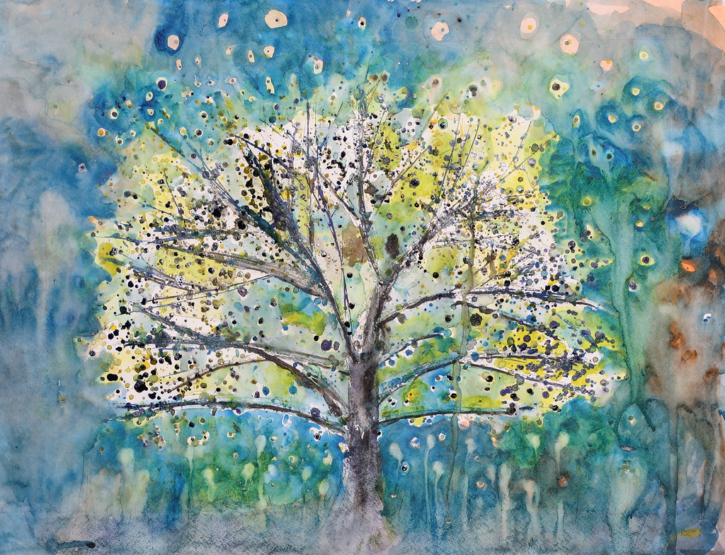
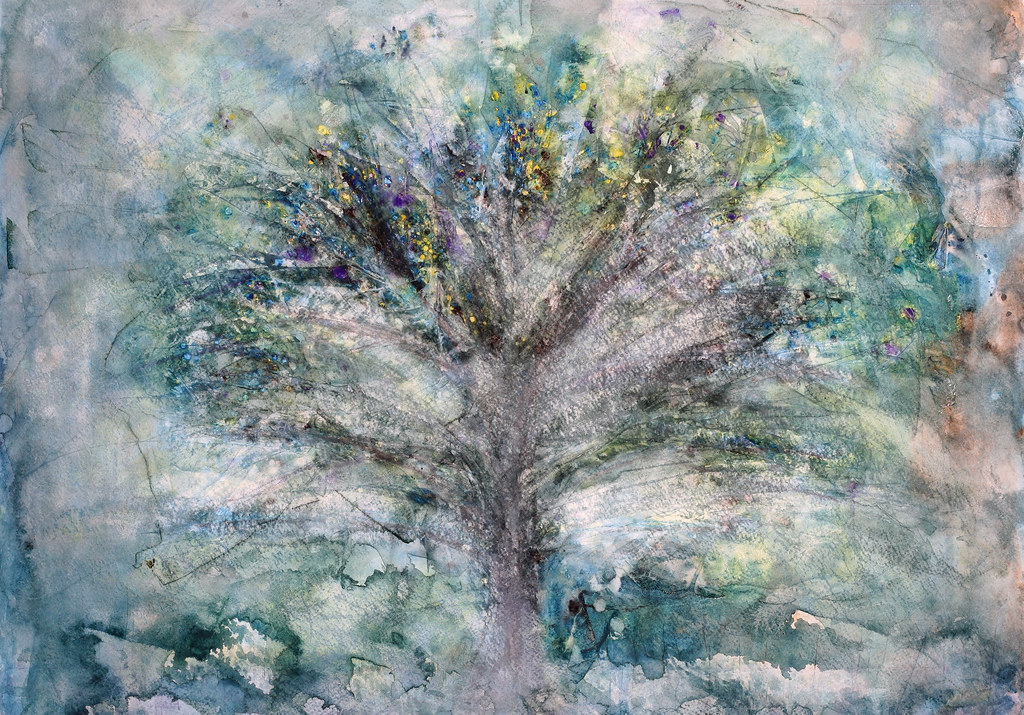
I really like the textures that were achieved on this one. I've been asked to do a big one of a tree, and I think the technique used here is what I'll use for that piece.

The commissioned piece will be less abstract, so I'll do a study to make sure the technique is applicable before using the big sheet of paper.

Geez I forget what that sheet cost. I think it was over $100 for one piece of paper?

Tuesday, December 27, 2011

Another Bodhi Tree


I think this is the third bodhi tree i've painted. They seem to be quite popular. Was recently asked to paint another one that is 36x48. That will be my biggest painting.


This one is 30 inches high. The friend that asked for it wanted a 36x36 painting, but paper that high is not easy to find. This was actually a piece of illustration board. I hope it is archival quality?


So after it was done and as photographed above, I cut it to 30 inches wide. My friend wanted a square painting. It didn't look as good square. I think next time I'll cut the paper to the size required before painting, so it will be painted to fit the correct ratio. That is the composition will be correct. I'm not against square paintings, I just think that i painted it in a rectangle and when it was cut to be square it didn't look as good.

Monday, January 24, 2011

Mountain Lake Abstract


I started this painting trying to stencil some curved marks onto the paper. They looked okay but i wasn't sure how i'd make a whole painting from this technique. So i quickly started using the brush full on.

I was probably using too watery a mixture because the painting was starting to look too greyish without any depth. I wanted some hard lines and texture so i put on the plastic wrap again.

I like how the black trickled down the wet wrap, so i covered the whole painting using this technique. Then the board was flipped over and red was applied in the same manner.

After drying it and flipping around to see which way it looks best, i settled on the vertical aspect. It looks a little like a mountain scene with a lake and red sunset reflections in the foreground.

I'm sorry the video has poor lighting. I started it in the late afternoon and most of the light was coming in the window. But by the time it was finished the lighting was tungsten so the white balance is wrong.

Tuesday, January 18, 2011

Closeup Portrait


I'm pretty happy with how this painting turned out. I didn't do any planning or sketching but carved out the face as I went along. It's a bit of a surprise the proportions are more or less okay. It looked better wet than after it dried though. There is probably a fixer or something i can spray on it to look wet? The nose looks a little too straight on and should probably be pointing more to the left. But maybe she is an ex-hockey player and it's bent out of shape? That's the story i'll go with. Overall I still like it.


Thursday, January 13, 2011

Moab


I made a time lapse movie of a pretty "realistic" painting. It's a bit longer than I hoped it would be. Sorry if it's boring.

First I applied a masking fluid to save areas where I wanted to put some green plants. Then I sketched out the hills. I looked at an old photo taken way back in the 90s. I put some plastic wrap on top of the wet paint to try and get a nice texture. I didn't like the texture and painted over it.

I mostly like the painting, but I might try it speedier and hope for more spontaneous happy accidents.

Saturday, January 8, 2011

Fire Abstract


I'm REALLY happy with the way this one turned out. I used a combination of paint and colored chalk. I smeared the chalk on while the paper was still wet, and then brushed that into the painting again. Then i laid clear film on the lower half of the painting for texture. If i could duplicate these results i'd make 100 more paintings like this.

Actually I've been working on a different technique today. Results were not expected but I'll save that for when I post that work.

It's been a good day overall. I've kept the tv off even though i don't watch it closely when it's on. Today seems more productive than usual. I'm thinking tv is more of a distraction than i've admitted. I've even worked out somewhat intensely, which is a huge turn around to the trend.

Friday, June 18, 2010

updated Bohemian Forest Woman


detail of work in progress

Even though i've had lots of great response to the photo of the painting posted two days ago, I wasn't quite satisfied. Jackie always yells "no, leave it alone" when she sees work in progress she likes, but i keep working it. Well we can always make a nice print from the photo of how that painting was.

Firstly i bought some masking fluid. I've never used that before. I applied it over the figure. Then i wetted the rest of the painting and put down plastic wrap with vertical wrinkles. Was hoping the results would look much better. The paper buckled horizontally when wet and the vertical pattern of the wrap didn't impact like i imagined.

So i'm going to try the realistic style again and see if i can paint some trees that make me happy. If not, they'll get massacred again.

These photos of the work in progress show the masking fluid over the figure. So i'm hoping that the figure will look like it did two days ago when i'm finally satisfied with the trees and peel off the mask. Stay tuned.

Saturday, December 5, 2009

Jong Ro Homage


I really admire the paintings of Jong Ro. I suppose the fact that i like her paintings is enough in itself, but i'm also wanting to learn a lot more about abstract painting. I wonder if there is a theory backgrounder that can be found on the subject, so that i might appreciate abstract much more?

Jong Ro painting.

Friday, November 6, 2009

Bodhi Tree

I've been asked by Joanie to make a painting. Cool!

Unfortunately i've been having a hard time getting something to be happy about. I initially wanted to do something drippy and fill in all the negative white space thereafter. This is crazy intensive for a big piece. But i spent some time trying it. When i got to the sky space around the tree, i really liked the little dots created from lifting the wet paint with a dry brush. The sky was a similar look as another painting Joanie liked.
So i thought i'd try to extend this wet and lifting technique into the dripped tree area. Perhaps i did it too much? But it wasn't turning out. Unfortunately painting doesn't have an undo button, so i just had to keep going forward. I even got a pallet knife involved with some scraping.
I think this piece of paper is beyond ever reaching a satisfactory state and i'll have to start with a blank sheet again.

Tuesday, December 16, 2008

Inspiration

I've been inspired to start this blog after viewing a video posted by Chase Jarvis, http://www.viddler.com/explore/chasejarvis/videos/27/
In this video the speakers talk about how you can get so much site traffic by giving people something of value for free, and what comes around goes around. Blogging helps people find you, know who you are, and explain what you're doing. When Google ranks you, what you're doing is mentioned over and over, so you'll get ranked higher than a static site.

I've watched this video about 4 times now and the nuggets I've taken from it include; providing value to a community with a common interest, turn myself inside out, be honest and share the frustration as well as the victories. It's about the human experience. Self promotion will fail.

This blog will document my painting. Hopefully I'll get in my 10,000 hours and become somewhat proficient at it over time. Here I'll share my trials and progress, and share techniques and inspirations with others interested in painting.