Friday, February 12, 2016

Sunday, October 4, 2015
Moraine Lake
The motivation for this one comes from a day trip to Canmore with the family. I was holding the baby like a football and walking while Di and the boys finished their hot chocolates. She wouldn't stop crying unless I got her away from her mom. She slept once I started walking, and my walking took me into a gallery. It was fascinating how the price of paintings depend mostly on their size. Di and the boys found us and started looking at the artworks too. Di expressed an interest in a big piece. We are so not in a position to buy a big piece of artwork right now.
When I got back to work in Ontario, I started wondering if I could do a big acrylic. My thing is usually watercolour. But a huge watercolour is beyond my competency. Acrylic materials are dirt cheap at Jysk. So I thought I'd give a little acrylic a try before getting a big canvas.

It's not like acrylic is super easy to get a good result. But there is the chance to paint right over mistakes. That's so not the case with watercolours where every brushstroke is permanent.

I'm reasonably happy with this work as it is below. But something may start to annoy me as the grass did. Maybe it needs to be hung upside down or sideways for a few days too?

Perhaps putting an oversize piece on the flight home isn't as expensive as I imagine?
Monday, September 7, 2015
The Longest Grass

One thing I'm trying with this sketch is working from a b&w reference photo. I'm hoping it will help get the tones relatively correct with more ease and not being fooled by changes in colour.

I did a crosshatch with the watercolour pencils to add colour to the background. Then I tried to take that texture out with a wet paintbrush and just have a solid colour background. I didn't bother to scrub all lines out. I figure when I add the grass in with the pencils after the paper dries, it won't be too noticeable

After the paper dried I added more lines for hair and grass and emphasized the dark part of the eyes, nose, and mouth.
I'm pretty happy with the end result. There wasn't as much magic if paint is applied on wet paper with a brush. But I'll stick with this technique for a few more paintings and see if it keeps improving.

Sunday, September 6, 2015
Barefoot on Grass

I've been really inspired by Ali Cavanaugh's work. It's figurative paintings of her children. Her results are really remarkable. Of course she has a really skilled and well practiced hand. I'm sure it will take me 10,000 hours to reach her level.
I tried a little portrait of my son. I enjoyed working on it especially because it was my son and my family is so far away right now.
It is an 9x12 inch painting. I started with a sketch using Reeves watercolor pencils. Then I brushed it with water. I kept reworking it to try and get the likeness correct. But I think it looks way overworked and still the likeness is not correct. Double whammy. Part of the issue was the face was only the size of a loonie and I was trying to do too much in such a small space. My brush is not small enough to maneuver in that tiny area. Just getting the basics and broad strokes of his face might have been enough. At least not looking overworked.
I'll try it again with a bigger space, maybe the size of a tennis ball to paint the face.
Saturday, March 28, 2015
Leaf of Gold study

I'm pretty happy with the way this turned out. It's a study of a Walter Phillips watercolour painting. Sometimes I don't know what to paint so I spend more time not doing anything than painting. I'm going to "study" other paintings a lot more. It gives me a chance to practice technique at the very least. Sometimes the study looks nothing like the original, so in those cases the original paintings are more like muses and it's probably fine to collect royalties from my work. This work looks an awfully like the Phillips painting, so I won't put it up.
To make this one, I sketched the mountains, cloud, lake and tree branch with a watercolour pencil crayon. Then I applied resist over the leaves and let it dry. Painted the sky, mountains, and lake and let it dry completely. Painted the branch and waited again. Finally I removed the resist and painted the leaves.
Some issues I have with the work include: the pencil crayon used was dark and it stained pretty good. I wish the outline of the mountains wasn't visible. The various layers of mountain rock is a great feature of the original that is missing here. As are ripples in the lake. Also the silhouette of the foothill trees is pretty rough and somewhat haphazard in my study. I should have found something finer to paint with.
So I learned a thing or two. Hopefully the issues with my next painting will be mostly new ones.
Sunday, February 8, 2015
Expressionist Moose

I started this painting at Swinton's in a class taught by Michelle Grant. She helped me getting the alignment of the moose right.
.jpg)

.jpg)
The one above is a filtered photo of the painting. I was trying different photo effects on my camera, seeing if any would steer me in a particular direction, since I wasn't set on if it should be high key or low and what the colours would be.
The photo below is also an effect that influenced my direction. I decided to desaturate the colour of the background by adding grey and hoping the figure would pop more with colour.
Below is the final result. It's still quite colourful. But I'm pleased with it. Moving on at any rate. Tired of fiddling with it.
Wednesday, November 12, 2014
Another moose
Another moose painting. I did this one quite quickly. Maybe two hours, tops. Mostly trying sort of a drip look. But I took some pains with the shape as well. Not so much with the colour. I quite like it.
I thought the rack on the last moose painting might be somewhat of a fluke. I really liked that part of the painting. But these ones turned out quite nice too. So perhaps it wasn't so much a fluke.
The reason I didn't take so much time was that I intend to start tracking my 10,000 hours painting. These being the first two. So I didn't want to get too detail orientated. Not sure if the logic is quite right there. Probably more because I'm not a detail orientated kind of guy. In painting at any rate, I like to use a big brush. If I spend 10,000 hours, I'm sure I'll come across the colours and style that's mine without fussing too much about it in the first two hours. However pro athletes are always saying they practice hard. So that's a totally opposite philosophy.

Tuesday, June 3, 2014
Moose
I painted this one pretty quick, three hours, one sitting. It's about 18x24 inches, watercolour on paper.
The difference between the first photo and second is the back of the moose around his hind. I thought it was too ambiguous about how it stood apart from the background, and bigger than intended. So I used an almost dry bristle brush and pushed the background down.

 I've taken a bit of grief about painting a realist moose. I chose the subject because I'm going to be showing some paintings at the central library and I'm hoping to sell a couple. All the downtown galleries are stocked with Canadiana. So I picked something there seems to be a market for. Thus the grief.
Anyway, I've been thinking if I did this painting again, I would add something in the foreground to frame the moose and give it more depth. Maybe trees around the edges as a dark frame.
I'm mostly happy with this. I especially like the way the antlers turned out which was truthfully more luck than planned.
The difference between the first photo and second is the back of the moose around his hind. I thought it was too ambiguous about how it stood apart from the background, and bigger than intended. So I used an almost dry bristle brush and pushed the background down.
Anyway, I've been thinking if I did this painting again, I would add something in the foreground to frame the moose and give it more depth. Maybe trees around the edges as a dark frame.
I'm mostly happy with this. I especially like the way the antlers turned out which was truthfully more luck than planned.
Friday, June 28, 2013
Library Exhibit
Louise Riley Library is exhibiting 13 of my watercolour paintings in June and July. Pretty stoked and inspired to submit my work to more galleries when they call for submissions.


Saturday, January 19, 2013
West Coast Trail


This is a work in progress
It's huge and taking forever. 40x59 inches. I see why big paintings cost so much more. The material alone cost so much. It's sucking up a lot of paint. Will probably be about 5 big 20 ml tubes. And the paper itself was in the $160 range. So that's about $250 total. And i'm not convinced it'll even turn out. I can't even imagine what it would cost to frame. But it will be unique.
I've never seen a watercolor so big. Keeping my fingers crossed it will turn out and not just be crumpled up and used as fire starter.
Saturday, December 1, 2012
Abstract Expression
11x17" watercolour

Monday, November 5, 2012
Landscape

I was happy with the way this one started. Before the above photo. I think one of the difficulties I'm having is not planning the colours before getting started and using transparent vs. staining paints in the wrong succession.
The painting below is still a bit tonally flat. The middle foreground shape needs to be dark as well. The hole into the background is also too big. It also needs a pop of colour; maybe red?

Update 12-Nov-12: I wasn't happy with the painting, so added a bunch of rose and violet while it was under wet plastic wrap. That didn't improve it. Was even flatter, muddier, and dark. So I tried to scrub off vertical strips of paint. And this is how it is. This is probably how I'll leave it.

Or I could run the whole kaboodle under the bathtub faucet and see where to go from there?
Tuesday, October 9, 2012
Abstract

I was organizing the office putting paintings into appropriately sized boxes, when I found a couple paintings that I appreciate now more than when they were completed. Pretty sure this is 2012 vintage.
I like the textures within the various colour fields. I also like the transparencies of the orange and blue on the left. I'm not sure what is on top of what and what it means?
Friday, October 5, 2012
Painting workshop

At first I wasn't too sure if Di picked the right course for me because Ms Lowden Pidgeon's paintings are quite different than how I see my style. But I think that is why I liked the workshop so much. I got to see two demos and try a completely new process of painting. I was exposed to new things, as opposed to if I'd taken a class on techniques I was already familiar with.
She is quite careful about planning her paintings. Choosing the colours and the order they will be applied. Making sure not to mute or muddy the colours, except of course when she means to.
The colours in this painting are a bit muddy, but we decided it was okay since these are meant to be shadowy areas.

The top photo is what I produced at the workshop. I was pretty happy with it at this point, but not 100%. So I took a photo and brushed some water over the trees and sky meant to appear distant. I didn't want those trees to be as boldly coloured as the foreground trees. The second photo is the result. I had unintentionally scrubbed whole trees from existence. The third photo is the final result. I painted distant trees again, but with paint much more diluted in water.

Viewing these three photos of the painting, it is also quite apparent the photoshop treatment is not consistent. the trees on the right were not repainted but the contrast changes quite a bit between photos.
Sunday, September 30, 2012
Not Landscape Abstract

Then I asked my friend what he thought of it, and he looked at it vertically. It really looks more interesting vertically than horizontal. So it's not a landscape now, and all that 3D perspective business is for not.
Saturday, September 22, 2012
Rorschach Card

Thursday, September 20, 2012
Plastic Wrap Abstract
I wasn't painting anything in particular. Hardly a plan. Abstract expressionism. This is the result.

It looks rather cold. My wife sees a person. I asked who, but she must have known I was teasing and didn't answer. It wasn't my intention to paint a figure.
The technique was to paint the entire sheet yellow, then lay wrinkled plastic wrap on top the yellow paint. The painting was stood upright and very wet runny grey and blue paint was made to run down the wrinkles under the wrap. This was allowed to set for 30 minutes or so, and then the wrap was taken off, washed under a faucet and layed on the painting again. Then violet paint was run under the wrinkles. This set for another 30 minutes and then wrap removed to let the paper dry.
Update 21-Sep-12:
So I said I was happy with the painting. But not over the moon. And I'd taken a picture of it. So why not give it another treatment. So I wet the paper again and let some runny cad yellow run under the wrinkles. When that dried, some spots were wet and lifted. Many of the edges look softer from the additional washes.
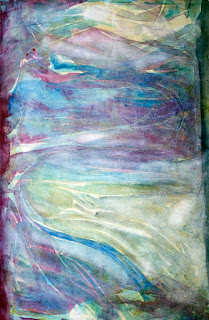

11x17" watercolour
It looks rather cold. My wife sees a person. I asked who, but she must have known I was teasing and didn't answer. It wasn't my intention to paint a figure.
The technique was to paint the entire sheet yellow, then lay wrinkled plastic wrap on top the yellow paint. The painting was stood upright and very wet runny grey and blue paint was made to run down the wrinkles under the wrap. This was allowed to set for 30 minutes or so, and then the wrap was taken off, washed under a faucet and layed on the painting again. Then violet paint was run under the wrinkles. This set for another 30 minutes and then wrap removed to let the paper dry.
Update 21-Sep-12:
So I said I was happy with the painting. But not over the moon. And I'd taken a picture of it. So why not give it another treatment. So I wet the paper again and let some runny cad yellow run under the wrinkles. When that dried, some spots were wet and lifted. Many of the edges look softer from the additional washes.

I'm still not over the moon about it. But I like it. I don't think it's going to be improved with any more similar treatments. It would take a major renovation to blow my hair back
Monday, September 17, 2012
Abstract Landscape

11x17" watercolour
At first I wasn't sure, but the finished painting is growing on me. I've flipped it upside down, looked at it in the mirror, close, far way. It seems pretty done.
Sunday, September 16, 2012
Work in progress
First did a sketch so I would remember perspective and keep the far away things narrow and the closer parts fat and juicy.

I started painting the far away bits of the tree, the backside of the trunk and the bushy leaf area. Then I painted the closer parts. I realized I should have painted the background first. So next time I'll do that. This is supposed to be a study for a larger project, so in that sense i've learned what to do differently on the big sheet.
Then I put the plastic wrap on the wet part and stood it up against a wall. I loaded my brush with water and applied the water above the painting so it would run down the wrinkles in the plastic wrap. Fingers are crossed, but will probably see something in need of a touch-up.

Thursday, September 13, 2012
Certainly thinking about painting more...

This one was "inspired" by another painting. But not to worry they don't even look remotely similar.
I really like the textures that were achieved on this one. I've been asked to do a big one of a tree, and I think the technique used here is what I'll use for that piece.
The commissioned piece will be less abstract, so I'll do a study to make sure the technique is applicable before using the big sheet of paper.
Geez I forget what that sheet cost. I think it was over $100 for one piece of paper?
Subscribe to:
Posts (Atom)