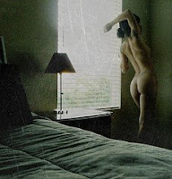
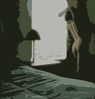
I modified the photo in photoshop by using the "cutout" button, which reduced the photo to four colours without any blending. Kind of a paint-by-numbers look.


But i want to use an art deco kind of colour palette, so i found a nice art deco poster, and sampled some colours from it and filled in my modified photo with these colours. I'm not completely confident this palette suits the subject matter, but it's pretty abstract and the subject might be lost to most people. So i'll give it a whirl.
The plan is to do a line drawing on my sheet of paper and fill in the shapes with colour and not blend but keep a crisp line between shapes. I'll try as best i can, being red/green colour blind, to match the colours in my modified photo by applying multiple layers of each colour. That is, i won't blend the paints on my palette, but try to achieve the proper tints by layering washes on top of one another.
Update: January 15/09
Update: January 15/09
I worried about doing the sketch. The proportions of the altered photograph are different than my paper size. The photo is more squarish than rectangular. It didn't turn out to be an issue though. I put the window lines at roughly 1/3 and 2/3 of the sheet and again about 1/3 up from the bottom and then took a stab at fitting everything from the photo roughly onto the sheet. I struggled a little bit trying to get the woman's bottom just right and finally resorted to drawing a grid on that part of the photo and another on that section of the paper to get her shape just like in the photo.
I tried to pick a red colour based on the warmth/coolness and realized several layers of washes would have to be applied to get the proper tone. The rest of the colours were also picked using this criteria.
I tried to pick a red colour based on the warmth/coolness and realized several layers of washes would have to be applied to get the proper tone. The rest of the colours were also picked using this criteria.
Obviously the dark background in the photo was more purplish than the blue that was going on in the painting, so after the blue wash dried, i put a red wash over it. This purple looked too red when dry, so i again put another layer of blue. This same process was used to try and achieve the tint of the blackish area at the bottom of the painting so it matched the altered photo. Many layers of washes of varying tints were applied.
At one point i decided a blue wash was necessary over the blue and red areas so i painted over both sections at the same time. I don't like the way that idea worked because some of the dried blue and red was lifted with the new wet wash and mixed with the neighbouring colours. So unless that effect is desired, i'd paint over each colour individually. I finally put black wash over much of the darker areas but i applied it over each color one at a time so the red wasn't transferred into the purple or visa verso.
At one point i decided a blue wash was necessary over the blue and red areas so i painted over both sections at the same time. I don't like the way that idea worked because some of the dried blue and red was lifted with the new wet wash and mixed with the neighbouring colours. So unless that effect is desired, i'd paint over each colour individually. I finally put black wash over much of the darker areas but i applied it over each color one at a time so the red wasn't transferred into the purple or visa verso.
I'm pretty happy with the result. It's looking a bit too paint-by-numberish for my taste, but i like that similar tones and tints were achieved as the altered photo. It might look really smart with a silver metallic frame. I'll try to pick one up from Ikea soon.
When i wasn't working on this or waiting for a layer of wash to dry, i was setting the piece upside down on the easel because i wasn't sure if Di realized the subject was a derrière, and she isn't usually too fond of any nudity or even painting girls with clothes on. So i was hoping this was too abstract for her to decipher. I was almost done though when she made some comment on the colour of the woman, so it turns out she knew what it was after all. She likes it too. Go figure. Women are complicated.
When i wasn't working on this or waiting for a layer of wash to dry, i was setting the piece upside down on the easel because i wasn't sure if Di realized the subject was a derrière, and she isn't usually too fond of any nudity or even painting girls with clothes on. So i was hoping this was too abstract for her to decipher. I was almost done though when she made some comment on the colour of the woman, so it turns out she knew what it was after all. She likes it too. Go figure. Women are complicated.


No comments:
Post a Comment